Levelling up with Micron21.


Micron21 is Australia’s first Tier 4 data centre. That’s a big deal. Tier 4 status is certified in line with the uncompromising global standards of the Uptime Institute, and signifies world-class hosting, network security and data centre solutions.
In short, it’s about premium technology, leading design, performance, and innovation. So naturally, we were excited about the prospect of collaborating with the team at Micron21, to capture and convey those qualities as part of an extensive website redevelopment.
To add to the challenge, the project played out while Micron21 underwent an extensive everything redevelopment: from the physical data centre itself, right through to a branding, collateral, and identity refresh.
The background.
In 2015, Micron21 began investing in superior infrastructure and specialist personnel; these were the first steps towards Tier 4 certification.
Fast forward a couple of years, and hundreds of tonnes of high-calibre data centre equipment and infrastructure is now integrated within the facility. Today, thousands of businesses depend on Micron21 for mission-critical business applications.
Our mission? To ensure the digital experience of Micron21 replicates the elite standards of the brand new Tier 4 facility.
Design and content.
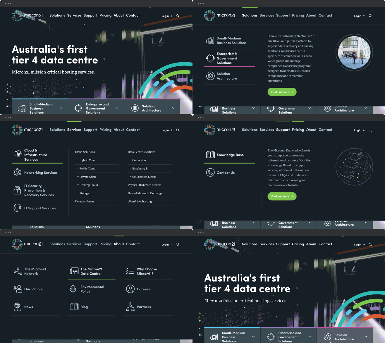
First up, the physical data centre is the heart and soul of Micron21. A cinemagraph features on the homepage, with the blinking lights of server racks conveying the unfailing pulse of the business. Bold images of staff and infrastructure feature prominently throughout the header and footer design too, to ensure customers get a tangible sense of the showpiece facility.
Data centre services are highly complex, so much of the approach to design and content hinged on making material easy to find and consume.
The homepage offers segmented navigation for primary audiences, ensuring speedy access to a selection of relevant products and services. There are dedicated areas for small-to-medium businesses, enterprise and government corporations, and clients seeking solution architecture.
Alternatively, if you know exactly what you’re looking for, the global navigation features a mega-menu, with colour and icon categorization for a comprehensive overview of the vast suite of services on offer.

Micron21’s mega-menu function on the global nav.
Once you drill down into a content page, sticky side navigation ensures everything’s on hand while you scroll through highly detailed long-form technical content.
Bespoke illustrations are peppered throughout the copy to highlight the complex value propositions of Micron21’s high calibre infrastructure. A simple, isometric visual style ensures that prospective clients get the picture quickly, and understand the intricacy and superiority of the systems on offer.
Micron21’s new branding identity is pushed out into various elements of the site. From a conceptual perspective, the refreshed logo represents security and complexity.
Born from the image of a safe’s turn-combination lock, the ‘Micron21 dial’ features multiple interconnected elements synchronised in precise coordination.
The logo plugs into custom page transitions and animations; it provides colour coding to connect different audiences with appropriate services; and it flickers throughout hover-states, button design and primary calls-to-action.

Build.
When your primary business is safeguarding information, security is a huge priority. As a result, the Micron21 site is built with Silex to bypass content management systems and the potential security risks that can sometimes come with them.
But it’s not all about being impenetrable—the site must be highly accessible for people seeking customer assistance or tech support, and easy to navigate when it’s time to buy.
Given technical support is a key aspect of Micron21’s business, the site features live chat, prominent contact information, and frequent links to the Micron21 customer portal. To keep transactions top-of-mind, there’s an order-form module that’s embedded in the sidebar navigation of specific services pages.
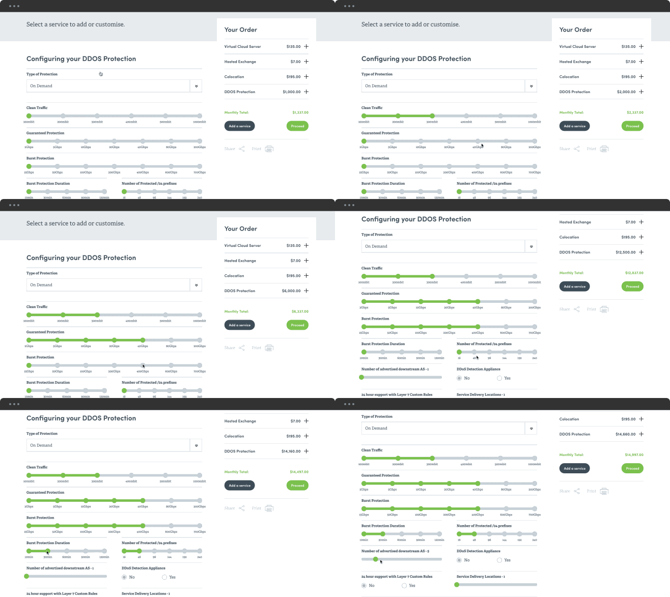
The module links through to a custom-built order form featuring simple visual sliders to help people tailor each order to their particular requirements. As you add or remove certain extras and service offerings, the cost and details of the order update in real-time.

Micron21’s order form slider in action.
So, if you’re in the market for any kind of data centre service—whether it’s purchasing a domain name or mitigating downtime risk through comprehensive DDoS protection—check out Micron21. They’re sure to have you covered.
More Articles
Up for some more?
Get your monthly fix of August happenings and our curated Super8 delivered straight to your inbox.
Thanks for signing up.
Stay tuned, the next one isn't far away.
Return to the news.