Building a little grid with a great deal of energy.


GreenSync is a global energy-tech company using innovation and imagination to completely revolutionise electricity markets around the world.
How? By creating a range of platforms, products and solutions designed to optimise every aspect of ‘the grid’.
As part of their vision for a brighter future in energy usage, GreenSync connects millions of resources to create dynamic electricity grids that are cleaner, more cost-effective, and ultimately better for everyone.
Over the course of three months, numerous workshops, and a couple of lightbulb moments, we joined forces to simplify the GreenSync story, and design and build some tools to help them better connect with homes, businesses, and regulatory bodies. And all in a flash, to have a shiny new website ready for deX’s industry launch.
Getting together to get a deeper understanding.
Before you can change a story, you’ve got to understand it comprehensively. To get into the collective heads of the GreenSync team, we conducted a series of deep-dive workshops and presentations. We made use of a purpose-built space in their Melbourne offices, and embedded an August team to encourage ongoing collaboration, clarity, and keep things powering to schedule.
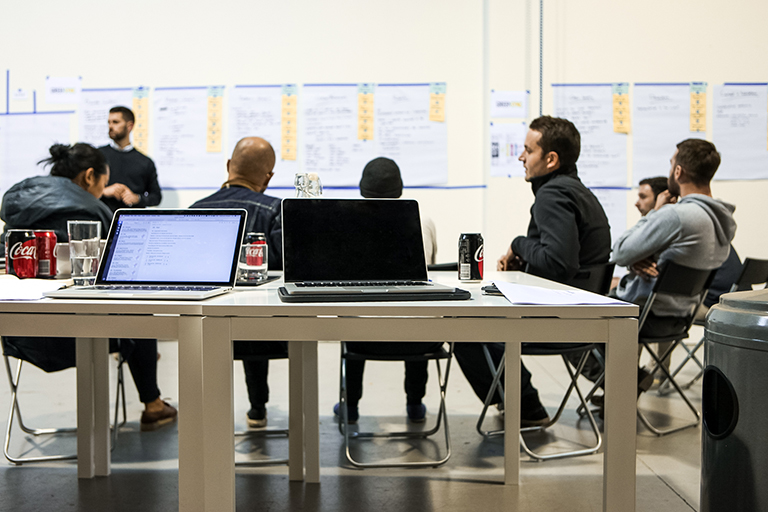
Deep in a deep-dive.
GreenSync’s products are innovative and complex, so it was essential that we had a clear understanding of how they solve problems and create opportunities. And whom for.
GreenSync sees the future of energy as ensuring anyone can participate and everyone wins. Whether you’re a large commercial or industrial business looking to reduce costs across multiple sites; a regulatory body hoping for greater visibility into the supply and demand of energy consumption; a homeowner looking to keep your power bills down; or a community trying to generate a clean, stable energy supply—there’s a GreenSync solution for you.
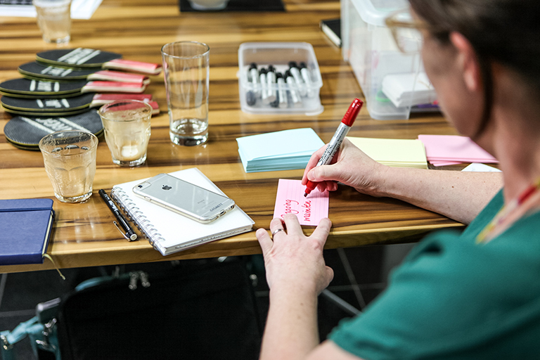
Mapping things out early in the project.
But each individual product is really one piece of a larger, more impressive puzzle. Across the board and around the world, GreenSync is reimagining the entire energy landscape. Their products work in conjunction to transform the way that everyone buys, sells, and distributes energy.
Lightbulb moment: we had to show the bigger picture.
We needed to highlight how each piece of the puzzle fits together and how different participants interact to share in cleaner, more cost-effective power. The brief was to make an intangible concept—the trade, accumulation, and distribution of energy—feel concrete.
We had to tell the story for each audience, and offer easy education into the current problems and future possibilities of electricity management; all while clearly guiding people to the right information, and the most appropriate products.
No mean feat, especially when you consider we spent weeks in workshops and interviews, and the average person spends a couple of seconds on each web page. People learn in different ways—whether through visual cues, getting a tactile sense of the subject matter, reading, playing, or anything else. Copy alone wouldn’t cut it.
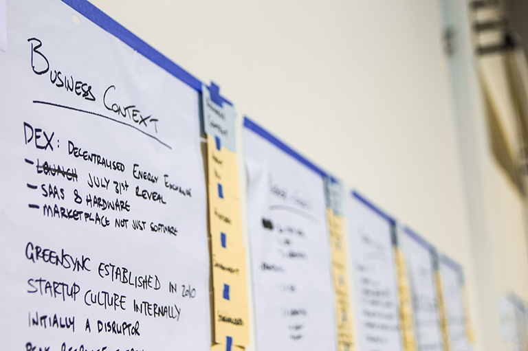
Getting our heads into GreenSync.
So, we designed and built a miniature, digital grid to tell the whole story quickly, and guide people through their experience in the most accessible and efficient way possible.
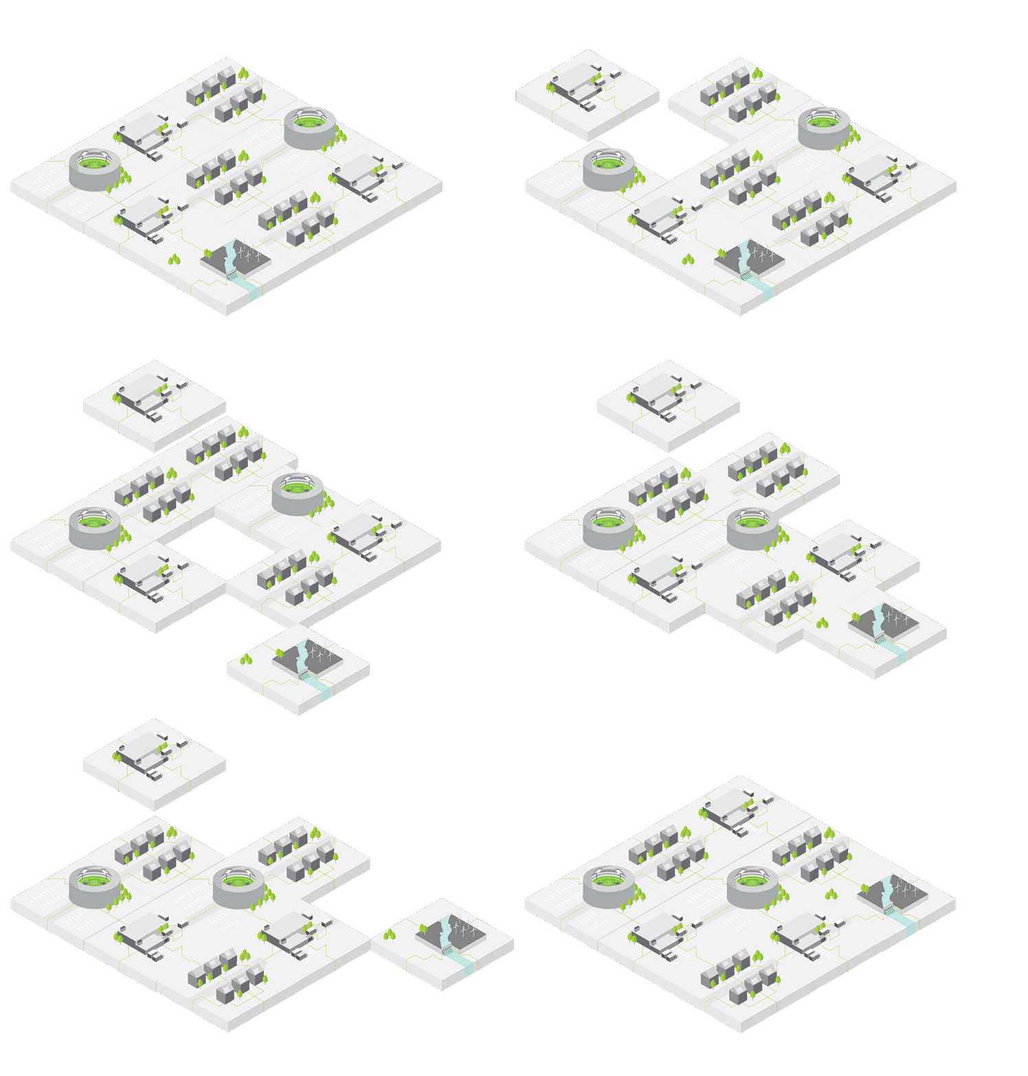
An early prototype, experimenting with how the grid tiles could interact.
Designing and building the GreenSync grid.
Each of the tiles represents a key audience, or a major market player in the grid. The tiles are built with bespoke isometric illustrations and scalable vector graphics, or SVG animations.
They come to life in the homepage header, tetris style, with animations via the GreenSock platform, GSAP.
The tiles act both as an educational tool and a means of segmented navigation, offering a clear and easy-to-follow journey for everyone on the grid.
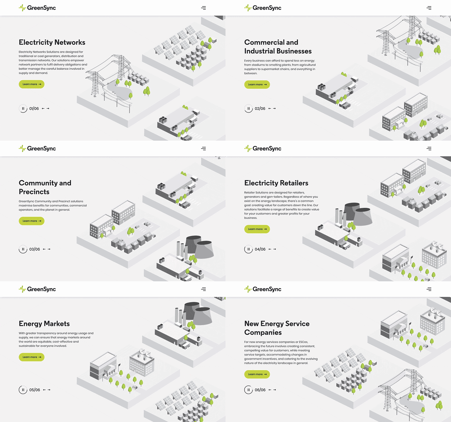
Choose the solution and information that’s most relevant to you.
The segmented approach continues in the form of a dynamic in-page signup in the global footer, designed to help GreenSync process their enquiries more efficiently and better tailor their engagement to whoever’s getting in touch.
Beyond the homepage header, the tiles feature prominently throughout other areas of the site, with elements of the SVG illustrations plucked off the landscape and peppered throughout the content. They’ve also made the jump offline and into the real world; the illustrations have been so well received they are becoming part of GreenSync’s consistent and ongoing brand language in brochures, signage, documentation, and more.
Given the tight project timeframe, we took a modular approach to designing and building out page elements around the tile illustrations. That way, we could create complex, flexible compositions from a palette of reusable elements and building blocks.
From a design perspective, we kept things clean and bold to convey a sense of sophistication and pragmatism; GreenSync is complex and forward-thinking, but they’re grounded and highly approachable too.
We ran several ‘design sprints’—collaborative sessions where everyone in the team draws up a potential design solution to solve a problem—to ensure we could hand-pick the brightest ideas from multiple brains. Inspiration is everyone’s responsibility: from engineers and salespeople right through to the C-Suite.

Grey leads and grey matter: design sprints for early concepts.
So far, it seems all the energy is paying off. In the month since the site went live, our tracking shows many more people are visiting the site, spending more time than they did before, and viewing more pages. They’re accessing the content much faster, with average page-load times nearly halved since the new site launch. And, the team at GreenSync have reported spending much less time explaining their products to clients and potential collaborators.
Want to learn more? Visit our case study for an in-depth look into the GreenSync project.
Or head over to the new GreenSync site to explore the grid, and find out what the future of electricity means for you.
More Articles
Up for some more?
Get your monthly fix of August happenings and our curated Super8 delivered straight to your inbox.
Thanks for signing up.
Stay tuned, the next one isn't far away.
Return to the news.