- |
- |

Whether you’re looking to buy some shoes, book a restaurant, provide some feedback about a service, sign up to a newsletter, or even apply for your next job as a developer, forms are essential to most websites these days.
A well-designed form can make a complicated process feel effortless. A large part of that is thanks to dynamic directional cues that are designed into the form. You know, clear instructions that outline the type of information you’re expected to provide, when, and in what format. And how to fix things if you accidentally stray from those instructions.
Some of those directional cues are provided through ‘form validation’. And form validation, especially client-side form validation, has become a key topic for developers.
Here, I’ll explore some different validation and error feedback techniques, methods and approaches you can adopt, and when you might be likely to use each one.
What is client-side form validation?
Before we can tackle what you need to know about client-side form validation, it’s important to understand the general concept of form validation.
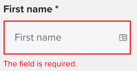
Say you’re shopping and you go to type in your postal address and contact number during the checkout process. If you type something silly that isn’t recognisable as an address or a contact number, you may see some red text appear below the input box.

The red text above? That’s form validation at work.
More generally, web developers can choose to validate any input field. Validation is typically used if the field is critical in the nature of the service or workflow (like a credit number in a checkout process), or if the information in the field is prone to human error (like a phone number; do you include an international dial code? An area code?)
Without directions, things can get confusing, quickly.
If the validation fails, developers provide a gentle reminder that something went wrong, with instructions for how you can move forward. That’s where the red text helps out.
These validation messages can take any form. Some common ones include:
- ‘This field is required’.
- ‘Please enter a valid email address’.
- ‘Your password should be 8 to 30 characters long’.
They’re also a great opportunity to convey the personality of your brand or product through some thoughtful microcopy, but that’s a topic for another day.
Now let’s get into the details.
There are two types of form validation: server-side form validation and client-side form validation. Although they serve different roles, both are very important.
1. Understanding server-side form validation.
Server-side form validation occurs after the browser submits the data and the server receives that data.
Before the data is written to the database, the server will verify the data and if it fails, the server will send an error message back to the browser.
Here’s how server-side form validation works:

- Someone fills the form in using a web browser;
- The browser sends data to the server;
- The server attempts to validate the data;
- If the validation fails, the server will send an error message back to the browser.
Server-side form validation is an important way to defend against false or malicious data and assists in maintaining data security.
However, it takes time to process a response, and responses are only triggered when the entire form is submitted.
Imagine you’re submitting a form with a questionable network connection. You wait for 10 seconds after submitting the form and then received an error message to inform you that the format of your email address is unacceptable.
If you’re inclined towards impatience (like I am), then you likely won’t be impressed. And this is why we need client-side form validation to help out.
2. Understanding client-side form validation.
Client-side form validation occurs on the browser side (this could be on your laptop, phone, or even your refrigerator). This means the validation takes place before the form data is submitted to the server.
Here’s how client-side form validation works:

- Someone fills the form in using a web browser;
- The browser attempts to validate the data. If it fails, it will show an error message without waiting for a response from the server;
- The browser sends validated data;
- The server sends the response.
The main benefit of client-side form validation is an immediate response as to why a form may not submit, which keeps the person using your product informed and happy. Ultimately, this contributes to a better experience of the form overall.
You know, in accordance with the very first of Jakob Nielsen’s 10 usability heuristics for interface design:
“Designs should always keep users informed about what is going on, through appropriate feedback within a reasonable amount of time.”
Good client-side form validation shouldn’t focus on exhaustive security measures. Instead, it should convey clear messages about the information and formatting requirements that are required to successfully submit the form.
Client-side form validation typically isn’t robust enough to protect against malicious people sending harmful data. However, it will easily upset someone with valid intentions if the format restrictions are too strong (like not allowing a ‘%’ character in a text area, for example).
So now we understand why client-side validation is useful, we can look at implementation.
There are two techniques you can use for client-side form validation:
-
Built-in form validation.
This particularly useful feature comes from the excellent HTML5, which can perform data validation without the need to write a line of JavaScript. Plus, it’s well supported by modern browsers and screen readers.
The built-in form validation uses the validation attributes of the form elements.
As an example, we can have <input type=’email’ /> and that should take care of the email input. The type attribute allows for a few more handy presets like email, phone, URL, DataTime, and number.
Beyond the different types of input, we can have some other attributes that provide fine-grained control over user input:
- ‘required’: which marks the field as invalid if it’s left blank.
- ‘minlength’ and ‘maxlength’: which provide control over the minimum and maximum number of characters that are expected in the form field.
- ‘pattern’: which allows web developers to provide a regular expression for achieving advanced validation rules.
In the visual department, CSS3 now supports a range of pseudo selectors to present form states in ways that are both accurate and generally much better to use: you can add the custom style under those pseudo-selectors in the CSS style file directly.
- ‘:required’ and its counterpart, ‘:optional’ help provide visual hints for the minimal input a person must provide before submitting the form.
- ‘:valid’ and ‘:invalid’ will help pin-point which fields are good to go and which require extra care.
- Combined with other structural sectors and pseudo-selectors, we can generate helpful error messages that are hidden by default, and only emerge when ‘:invalid’ is decreed.

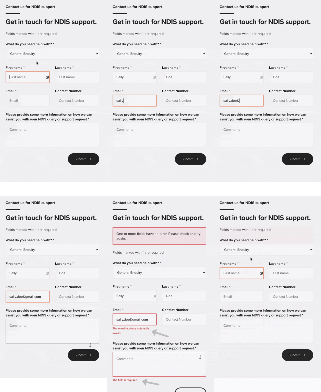
See the red text and the arrow in the sequence above? That’s conditional client-side form validation: it’s only displayed when an error is detected in the information that’s provided for specific fields throughout a form.
Of course, a time may come when plain HTML and CSS are not enough. This could happen because of a particular business requirement or workflow that needs to be considered in your project.
Let me give you an example.
Imagine you need the following: ‘use the checkboxes to choose a maximum of two flavours of ice-cream, only if neither of them is chocolate. If chocolate is chosen, the other flavour must be mint’.
This may also happen when we want an error message based on one or more dynamic values. Like password confirmation, where the validity of the password requires knowledge of another field: the original password field.
These examples can add another layer of complexity, but luckily we have one more trick up our sleeves:
-
JavaScript validation.
Normally, the standard DOM API will be enough to handle most considerations pertaining to form logic. It provides a number of built-in form validating properties and methods by using JavaScript. We won’t go too deep in this article, but feel free to check it out in further detail, here.
If you are working with some legacy browsers that do not support the modern DOM API, you might need to write your own JavaScript to validate the form, which requires much more heavy lifting.
There is another, easier way to use JavaScript validation: through an existing JavaScript form validation library, such as Validate.js. Normally a good validation library will give you the ability to manage as many customisable items as possible, and handle any potential legacy browser issues.
Wrapping up.
In summary, client-side validation is a common problem most developers will face. The main reason for this is partly because—like many other tricky problems—there are so many potential ways to approach it.
For the best chance at success with client-side form validation, you should be mindful of all the potential choices at your disposal. Then, make each judgment on a case-by-case basis.
That said, this article is meant to point out possibilities, not constraints. So, don’t be afraid to try out different ideas and perspectives, even if it’s not immediately obvious whether they’re good or bad based on your circumstance.
After all, one of the most important traits for a developer is the ability to glean more from your mistakes than your accomplishments.
Good luck!
More Articles
Up for some more?
Get your monthly fix of August happenings and our curated Super8 delivered straight to your inbox.
Thanks for signing up.
Stay tuned, the next one isn't far away.
Return to the blog.
