- |
- |

They always say that the first month of Spring gives us a chance to clean out the cobwebs, paint a new canvas and get ready for all that the warmer weather brings.
I’m not sure who ‘they’ are, but I know that this September, I have become a little obsessed with capsule wardrobes and living minimally. As I started reading through this month’s collection of articles from the team, I decided to ‘fashion’ this edition of Super8 by selecting the eight essential pieces you need in your wardrobe — or locker — for the month of September. And because September is the month of footy finals, spring racing and Melbourne Spring Fashion Week, I figured we’d go the extra mile and make it the most memorable capsule wardrobe you’ll ever have.
1. But what does voice search actually mean for marketers?
- Read the full article here.
- Written by Richard Baxter.
- Submitted by: Rowan Barnes.
Every capsule wardrobe in Spring needs an innovative and outrageous fascinator, capable of winning first place at fashions on the field. Like an ornate trackside headpiece, the concept of voice search technology is ostentatious, somewhat experimental and intricate. Plus, it’s simply fascinating. But do marketers need to know about it? Or can we shrug it off for a while until it is shouting for our attention?
In this piece, Richard Baxter explores voice search in general, as well as the pros and cons of platforms such as OK Google. He identifies the futuristic potential of this technology – like, being able to order us a pizza autonomously – but notes that sophistication is limited at this point, given the relative infancy of the concepts.

While it can’t order us a pizza just yet, voice search technology is certainly heating up.
In that vein, Richard suggests that the real voice search revolution is yet to happen. I tend to agree. Many platforms are still in development. While they may revolutionise how we live when they’re released, they are still a while off. For example, Amazon Echo, Google Home and Apple’s new version of Apple TV are all still in build.
Can this technology help a business improve service to clients by providing voice search results, rather than web page results? Can an end user’s perception of a brand positively change if they have a great experience of service using voice search? We don’t know at this stage, but understanding the technology and its potential implications will be essential for staying in the know.
2. John Maeda’s new design problem: tech’s utter lack of diversity.
- Read the full article here.
- Written by Katherine Schwab.
- Submitted by: Zoë Warne.
Flat boots are a staple in any wardrobe and they’re the second essential component to our September capsule wardrobe. Flat boots are inclusive; they want everyone wearing them to have a great experience, be comfortable and make their feet happy. Good digital products, made well, are the same.
‘Companies like Microsoft and Google believe that a product will be better for everyone if it meets the needs of someone in an underserved demographic.’
This piece by Katherine Schwab looks at John Maeda’s new role with Automattic and the problem he faces. He believes his goal is to ‘help the community to unlock its own ability to understand what design is, and become better designers in the process.’ If you haven’t come across Maeda before, he’s well worth reading about. Having formerly lead a research team at MIT Media Lab for 12 years and more recently at Kleiner, Perkins, Caufield & Byers, Maeda now moves to Automattic – the parent company of WordPress, WooCommerce, Jetpack and many others.
Schwab’s article is like a pair of flat boots made with superb Italian leather. Yes, the news about Maeda is interesting and fashionable for the digital cognoscenti, but the quality and meat of this piece is in the research and principles around design and inclusion. Maeda advocates questioning any product, any content, and finding a way to create a better outcome. It’s about making sure your product doesn’t miss anyone; that it’s inclusive. Available and ready for all. Just like a good flat boot.
3. Four things I learned designing user interfaces for VR at Disney.
- Read the full article here.
- Written by James Hsu.
- Submitted by: Athalia Foo.
A footy jumper is iconic. It is eminently functional and immersive at the same time: your ticket for admission to the innermost sanctum of your chosen tribe. A good VR experience is also iconic, functional and immersive; the gateway to an alternate reality that allows you to experience a moment or engage with a product platform. As James Hsu says, ‘the VR design space is hot hot hot’. James has worked at Walt Disney on their Disney Movies VR product as the lead UI designer. This article documents his experience.
James keeps it simple with four key learnings. His insights are clear and to the point. I read the first section of his article, about print design being relevant to VR, and whole heartedly agreed. Check out the piece and you’ll understand why.
The user interface for Disney Movies’ VR on Oculus Rift.
Footy jumpers offer snapshot insights. They can provide an expression of someone’s dedication, their allegiances, their personality traits and maybe even how long they’ve had the jumper, depending on the condition of it! They’re also simultaneously classic and contemporary – speaking to history and past narratives, while employing cutting-edge technology and design in the hope of facilitating elite performance. I found James’s piece the same. It reiterates some classic truisms, offers some forward-thinking insights, and provides a great overall perspective into the considerations of designing for VR.
For those in the know, this piece will have some handy hints for you. For others like me who were curious to learn about this technology, it’s a great window into the VR space.
4. The greatest sales deck I’ve ever seen.
- Read the full article here.
- Written by Andy Raskin.
- Submitted by: Elliott Grigg.
A good pair of jeans is essential. Find and customise the right type for you, and you’ve got a match made in heaven. A potent partnership.
‘Good denim is suited to any situation: it makes an appealing impression no matter the environment or audience.’
Kind of like a sales deck that perfectly encompasses a business proposition with equal weighting on story and sales pitch; that is structured beautifully; that is rich in content and substance.
When Elliott shared this article with the team, he mentioned his fascination with the psychology of sales. This piece provides some general insights into creating an effective pitch deck and explains how people respond to certain presentation techniques.
After reading this article, I challenge you to customise your pitch deck like your favourite pair of jeans. The approach outlined in this piece might be the greatest deck Andy Raskin has ever seen, but does that mean it’s applicable for everyone? There are certainly some key elements I think will come in handy. For example, keeping in mind the concept of the Promised Land and making sure everyone within an organisation is familiar with ‘the narrative’. Read this piece for some inspiration on how to tailor your perfect sales pitch.
5. Getting out of the way: how to invite growth, engagement and collaboration in others.
- Read the full article here.
- Written by Will Harper.
- Submitted by: Mark Davis.
Encouraging engagement and collaboration with others is not a new concept. It’s tried and true, traditional, a well-trodden route to success. Just like a blazer.
But a blazer with luxurious silken lining, and an incomparable pocket detail – that’s something different. Something steeped in convention but with unique character. This article is that blazer.

Good blazer? Can’t go wrong.
Will Harper talks about ‘getting out of the way’ vs ‘getting in the way’ in the process of inviting and encouraging growth and collaboration with other people. What I like about this piece is how articulately he describes the phenomenon of each concept. The insight is enormously relatable. I found myself reflecting on past situations and identifying whether I was in or out of the way, and recognising the different outcomes or behaviours of others as a result.
Take a look and see where your approach fits: are you in or out of the way?
6. Microsoft wants autistic coders. Can it find them and keep them?
- Read the full article here.
- Written by Vauhini Vara.
- Submitted by: Sarah El-Atm.
I couldn’t resist including this article in this month’s Super8. Much like I can’t resist a catwalk-worthy pair of shoes that are full of character, life and the show-stopping appeal that is typical of a Melbourne Spring Fashion Week show.
We put a lot of effort into who and how we hire. We’re comfortable breaking convention in how we hire and drawing on inspiration from other organisations to understand if there is a particular market demand or trend that we should keep our eye on. Ultimately, we want to attract and recruit great people, awesome new Augies who will help make us better. That’s why Microsoft’s focus on hiring developers with autism was so fascinating to me.
Vauhini follows the experience of Blake Adickman, a 26-year-old developer who has autism and successfully made it through Microsoft’s hiring program. Broadly the article covers why people with autism find it hard to gain successful long term employment and points out some key characteristics of autism that I think we can all learn from and be more empathetic to – especially within the context of hiring.
Learning about Microsoft’s focus and intention throughout this approach prompts an intriguing question: how many other organisations are doing this and not talking about it? Or if it’s not happening in any other companies, when will it become the norm?
7. From demagogues to the mental fog — the side effects of the information age.
- Read the full article here.
- Written by: Paul Ratner.
- Submitted by: Emily Duckham.
A good white shirt takes you places. Actually, it can take you anywhere. Pair it with the denim in your capsule wardrobe, the blazer and ankle boots and you have one damn fine classy outfit. White shirts are crisp, clean and focussed. Mental fog, however, is none of those things. Paul Ratner looks at the side effects that have eventuated from the age we are living in – the information age.
Paul tracks the evolution of the information age. Did you know that in the last ten years we’ve created more information than in all the human history that preceded it?

No wonder there’s talk of mental fog! Not only does Paul provide useful and valuable evidence about the creation of this imposing amount of information, he also questions why we would bother consuming it.
‘Information overload contributes to mental fog, which causes increased cortisol levels in our bodies and ultimately elicits more emotional reactions to stimuli.’
So next time we read that blog article by ‘Mr. Expert’ and react so strongly we post a comment on the article questioning the factual basis of anything he’s saying? Paul argues that this is a side effect of the information age.
Backed up by a range of sources, Paul examines the emerging side effects of the phenomenon and it’s a fascinating read. While this article might not be directly reflective of a crisp white shirt, hopefully by recognising some of the side effects we experience in this information age, we can slow ourselves down, clear the mental fog and help our brains be crisp, clean and focussed.
8. Cognitive bias cheat sheet.
- Read the full article here.
- Written by: Buster Benson.
- Submitted by: Daniel Banik.
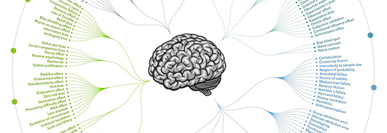
The right belt ties a whole outfit together; it adds an element of completion. Just like the final piece of our capsule wardrobe for September. Buster Benson draws on a vast amount of credible resources and pulls them together in an engaging article and infographic.
We all develop cognitive biases for a number of reasons, but primarily to save our brain time and energy. Buster structures this article by discussing biases based on the problem they try to solve. As a result, each of the examples is incredibly easy to understand and unpack.
Buster’s infographic at the end of the cheat sheet is awesome. No doubt about it. If the article is a little TL;DR for you, just scroll to the bottom of the page and marvel at a neat snapshot of all the different types of biases that can exist in the human brain – it ties everything together perfectly and makes the article feel complete.
***
And that encapsulates another Super8. We hope you’ve enjoyed exploring the articles that have kept us intrigued and inspired this month, and remember to keep you eyes peeled for the next installment.
More Articles
Up for some more?
Get your monthly fix of August happenings and our curated Super8 delivered straight to your inbox.
Thanks for signing up.
Stay tuned, the next one isn't far away.
Return to the blog.


