- |
- |

If you’re looking for a fresh burst of creative energy to sustain you on the home stretch of 2019, you’re in luck: I’ve got the process of sourcing inspiration down to a fine art.
This month, I’m brushing up on all things art and aesthetics. French artist Edgar Degas once said ‘art is not what you see, but what you make others see’. Well, buckle up, because your eyes are about to experience an eclectic exhibition featuring Piet Mondrian’s creative process, user research lessons from ‘Mindhunter’, and more. It’s all here in Super8 in November!
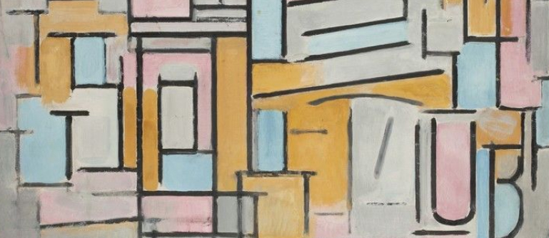
1. Piet Mondrian on how to be an artist.
- Read the full article here.
- Written by Alexxa Gotthardt.
- Contributor: Bridget Noonan.
When you’re talking about creativity and inspiration, Piet Mondrian provides a fairly compelling blueprint.
Most people will be familiar with Mondrian’s celebrated ‘de stijl’ aesthetic: varying geometric shapes with vibrant splashes of primary colours. However, Mondrian moved through many periods during his artistic career, continuously questioning and redefining himself as a pioneer despite countless personal and professional challenges.
So, how did he do it? These four rules—sourced from Mondrian’s writings and interviews—provide the answer: a mix of self-advocacy, friendliness, exposure to new experiences, and patience.
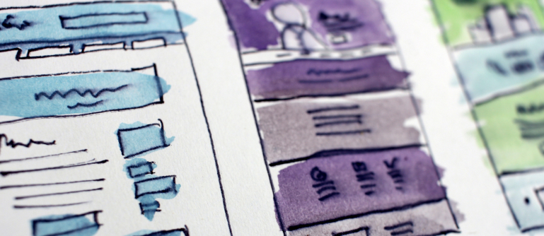
2. The aesthetic-accessibility paradox.
- Read the full article here.
- Written by UX movement.
- Contributor: Rowan Barnes.
It’s a common misconception that accessibility in design is only achieved through the sacrifice of aesthetics. It can be tempting to think in binary terms: the more accessible an interface, the less aesthetic appeal it has. And vice versa, the more pleasing an interface, the more challenging it becomes to adhere to standards like WCAG.
While balancing aesthetics and accessibility isn’t easy, it is possible. Plus, it’s key in designing an experience that appeals to the greatest number of people possible.
Remember, good work is hard and hard work is good.
Learn how you can meet in the middle and avoid the aesthetic-accessibility paradox.
3. Why some breakthrough ideas don’t break through.
- Read the full article here.
- Written by Drew Pearce.
- Contributor: Isabel Silvis.
Netflix vs Blockbuster. Amazon vs Webvan. History is riddled with these comparisons: breakthrough success vs total breakdown.
What are the deciding or contributing factors that can make a ‘big idea’ a huge success? There are so many factors, from timing and context to the opportunities or limitations of existing sector infrastructure.
In this piece, Drew Pearce points out that many world-beating innovations are iterative, having modified the approach of earlier—often unsuccessful—pioneers.
The idea that inspiration comes from nowhere is totally romanticised and completely unrealistic. As Drew points out, ‘light bulb moments don’t do much good without the pre-existing powerlines to deliver electricity’. Check out five practical lessons to give your next big idea the best chance at success.
4. What does it mean to be a resilient designer?

- Read the full article here.
- Written by Christina Bruce.
- Contributor: Mel Bruning.
Vincent Van Gogh notoriously cut his own ear off. Jean-Michael Basquiat was hit by a car at age seven. Countless other artists have done things the hard way, forging celebrated careers despite mental illness, injury or addiction.
What does that have to do with design, technology, or UX? Everything, according to this piece by Christina Bruce, because resilience is key.
The psychological capacity to adapt to stressful circumstances and bounce back from adversity is critical, whether you’re hanging in the Guggenheim or developing products for Google.
Christina provides seven key traits of resilience: not taking things personally, abandoning the concept of ‘wasted time’, and more. Are you resilient? Find out now.
5. The case for being good enough.

- Read the full article here.
- Written by Brad Stulberg.
- Contributor: Daniel Banik.
‘Don’t aim to be consistently great; aim to be great at being consistent.’ With that succinct wisdom, Brad Stulberg provides a useful mantra for any life process, from parenting, to coaching, to running, to managing, to teaching, to writing or making art.
Although it’s tempting to strive for perfection, it’s also mathematically implausible. What’re more, ‘being perfect every once in a while and internalising it as an ongoing expectation is a surefire way to lose motivation, experience anxiety, and burn out’. By being ‘good’ all the time, we ultimately create a platform to be great. Find out why being good enough is more than enough.
6. Why we love to hate Comic Sans.
- Read the full article here.
- Written by Danielle McCLune.
- Contributor: Sarah El-Atm.
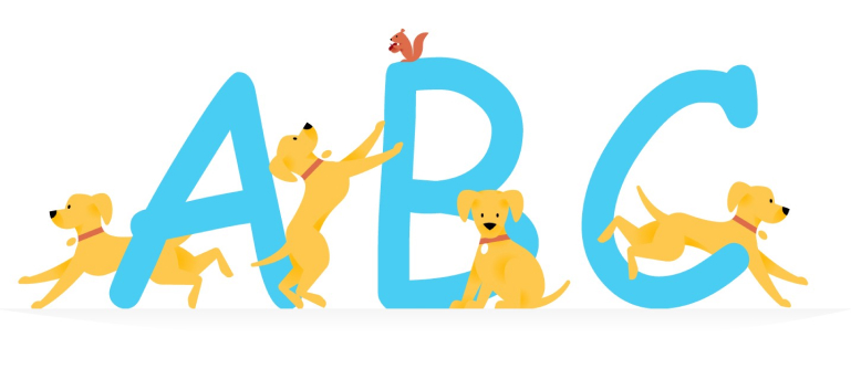
Hear me out. Comic Sans is a truly artistic typeface. When you understand the complex history of how Comic Sans came to be, you realise it’s a pioneering example of expressive design.
The original intention of Comic Sans was to capture the imagination, to inspire, and to convey a sense of play when font choices were extremely limited.
In this comprehensive tale of experimentation, rejection and redemption, you’ll learn ‘why dogs don’t speak in Times New Roman’, how Comic Sans is disrupting the modern design community’s perception of itself, and ultimately, why we love to hate the much-maligned font.
7. Warner Bros.’ new brand is a glimpse at the future of entertainment.

- Read the full article here.
- Written by Fast Company.
- Contributor: James Otter.
Ah, the original, golden Warner Bros.’ shield. Few symbols or insignias evoke such a warm sense of mid ‘90s nostalgia. For Pentagram, that was exactly the problem.
There’s so much value in the content that sits beneath that vintage golden shield—from the Dark Knight trilogy and Looney Tunes to Harry Potter—but in an era where streaming services and platforms take precedence, the studio found itself stuck in an awkward spot between past and present. How do you ‘recalibrate’ a brandmark without reinventing the wheel? Or in this case, shield? Find out with this piece from Fast Company.
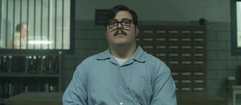
8. 11 things I learned about user research from watching Mindhunter.
- Read the full article here.
- Written by Arnav Kumar.
- Contributor: Elliott Grigg.
Psychology. It’s the gateway to so many considerations of the human condition, from art and creativity through to user behaviour and, well… serial murder.
‘Mindhunter’—the true story of how the FBI developed psychological profiling techniques for criminals in the ‘60s and ‘70s—is an excellent TV show, but for Arnav Kumar, it’s also an elucidating framework for user research practices.
Learn about the importance of listening, the value of strategic improvisation, the significance of patterns, and how to make participants comfortable. That is, if they’re not shackled to a chair in a maximum security prison.
More Articles
Up for some more?
Get your monthly fix of August happenings and our curated Super8 delivered straight to your inbox.
Thanks for signing up.
Stay tuned, the next one isn't far away.
Return to the blog.
