Publish once and populate in many areas: adopting the ‘no wrong door’ approach to content architecture.
- |
- |

Content architecture—and let’s be honest, content in general—is often a source of anxiety for marketing teams when it comes to website projects.
Questions often abound. Questions like:
- What if there are conflicting views about where content should live on the site?
- What if we can’t come to agreement on the structure of the site?
- What if there are multiple areas where one piece of content might live?
These are all valid questions. And all scenarios that pop up when a team is considering website content architecture.
Then there’s the scenario where your users, visitors or supporters will expect the content to live in multiple areas throughout the site. In these cases, the winning rule of thumb is this:
If it makes sense to your most committed supporters and advocates, make it work on your website.
Animals Australia faced this very scenario when building their website.
After a user research program and interviews with a variety of supporters, it became clear there were two key goals for visitors in relation to content:
1. Get a sense of timely issues that require attention or support (i.e. view the latest news).
2. Get a sense of all the issues and updates pertaining to a specific category of interest (for example, everything someone should be aware of in relation to greyhound racing, or live export).
These two destinations are obviously not mutually exclusive. If there is an unfolding issue in the news about live export, a supporter would reasonably expect to find any relevant updates in both sections of the site. There’s no point having an ‘everything live export’ section that doesn’t include the latest news. And vice versa.
So, what happens when one content piece has multiple, logical homes?
Adopt the ‘no wrong door’ approach to information architecture. This is based on the idea that there needn’t be a single pathway to any piece of content.
In some scenarios, people need multiple ways to access the same one piece of material. It’s common in publishing and editorial websites like The Age, ABC News, or The Guardian.
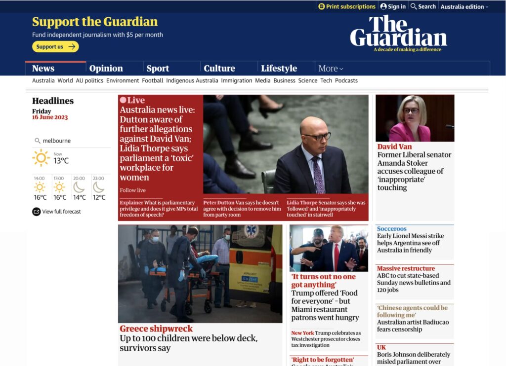
On a site like The Guardian, you will find multiple pathways to the same piece of content.
It’s also common in cases where a product or service might appear across multiple categories. Guide Dogs have a goal-based website architecture where services are categorised based on the objective they support people to achieve.
The Orthoptics service is relevant to people hoping to both Live Better At Home and Get Support Through A Change In Vision.
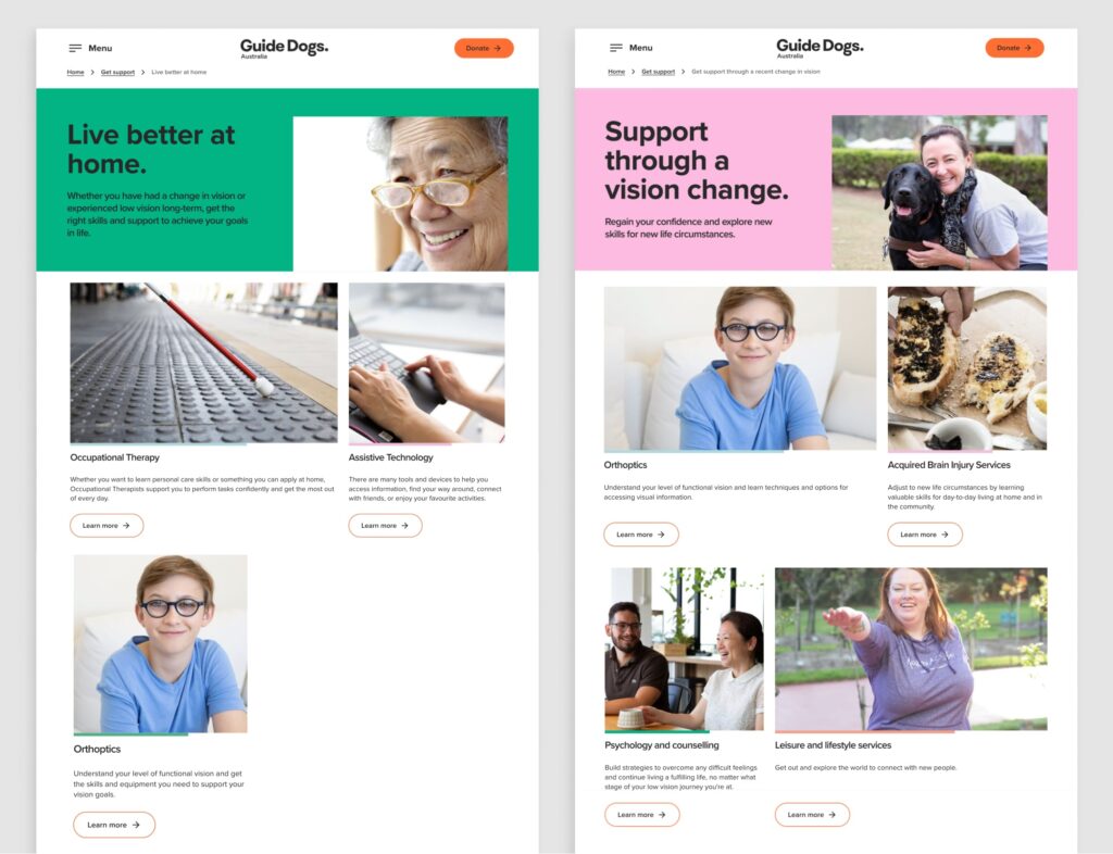
Here, you can see the Orthoptics service is discoverable via multiple pathways on the Guide Dogs site.
The ‘no wrong door’ approach is achieved by publishing a piece of content once—a single representation in the back-end of the website—and having it surface in many areas on the public facing front-end.
While it’s a great technique to have in your toolkit, there are still questions:
- What are the possibilities when implementing this type of approach?
- What are some of the ‘gotchas’ to look out for?
- How do we protect against things getting messy and avoid multiple duplicate content pieces throughout our site?
- What are the implications for teams publishing content on the website?
Let’s take a look at some of the answers.
How do we ensure it is easy for our team to manage and maintain?
Animals Australia built their publishing system with a focus on simple and efficient content management. From a technical perspective, the team use WordPress custom routes to surface content in multiple locations, with ‘custom taxonomies’ so content producers can flag multiple areas for content to appear throughout the site at the touch of a button.
This approach ensures site administrators manage each piece of content in one central place, without having to republish the same article in multiple locations throughout the content management system.
A simple set of controls allows content publishers to emphasise one content piece throughout many different areas of Animals Australia’s site architecture.
A set of controls allows you to select from common areas an article may need to feature throughout the site. For example, you could choose to place greater emphasis on a content piece by highlighting it:
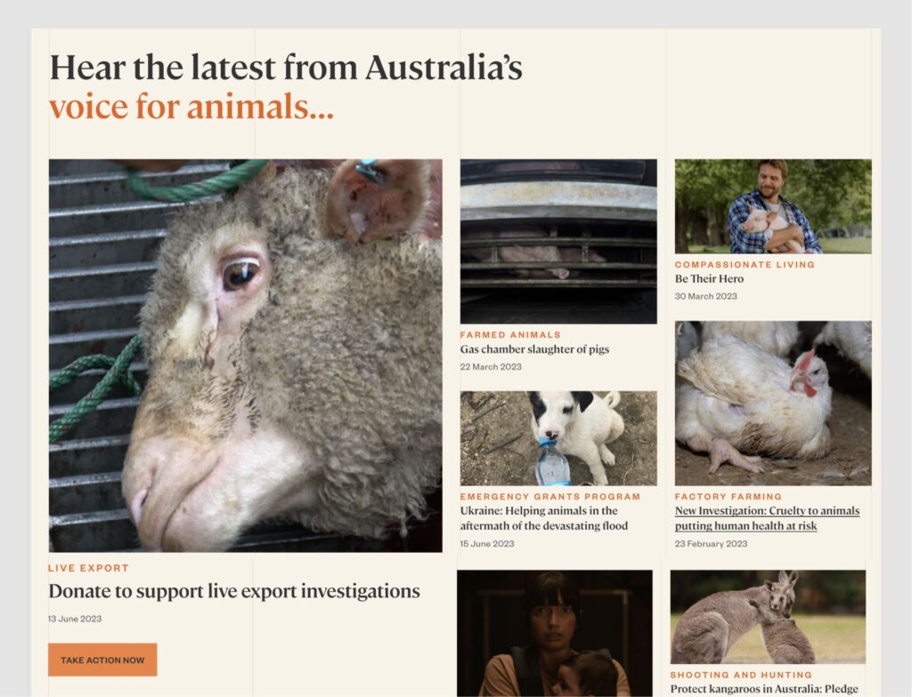
- As a prominent piece of content of the homepage ‘latest news’ grid.
- As a featured content piece against a specific category, like factory farming.
Controls in the publishing system allow you to choose which pieces are emphasised in different areas of the site.
How do we ensure our content architecture doesn’t get messy?
Control and flexibility are important, but too much flexibility can compromise structure. It’s crucial to provide some constraint around where content can, and cannot, be published.
Animals Australia have some flexibility, as outlined above, because they also have clear rules built into the logic of the system about where certain types of content can appear within the information architecture.
These rules are informed by the desires and goals expressed by supporters in the research interviews.
Anything tagged as a ‘news item’ automatically publishes to the latest news feed. This ensures this section is always up to date with the latest news content and removes reliance on manual effort from the team. Side note: ‘news’ is distinct here from campaigns or petitions, which have their own area in the site.
At the same time, each news item requires a mandatory ‘issue tag’ in order to be published. Live export and factory farming are examples of issue tags. This ensures the same news item is listed against a relevant issue that supporters visiting the site may hope to learn about.
In addition to news articles, each issue page—like live export and factory farming—automatically pulls in other types of content from the site, including petitions, campaigns and pledges that are relevant to the cause. It’s designed to provide a comprehensive overview: ‘show me everything I should know about live export and all the ways I can support your advocacy in this space.’
By automating structure, Animals Australia remove the burden of manual updates and ensures there are clear, definitive conventions for which types of content appear in different places.
These conventions, again informed by the views and goals of supporters, ensure people coming to the site will be able to find and achieve what they want, quickly.
Think Global Health—an online resource that examines the ways in which changes in health reshape economies, societies, and the everyday lives of people around the globe—uses a similar convention.

In the above screenshot, Think Global Health’s ‘The Latest’ feed (on the far right) is an automatically updating snapshot of the most recently published articles, which reflect the themes you can see along the site’s main navigation, underneath the logo: environment, poverty, trade, governance.
With this approach, you could access the same piece of content by viewing all of the latest content, or by going to the ‘trade’ section of the site, below, which pulls in all content orbiting around that specific topic.
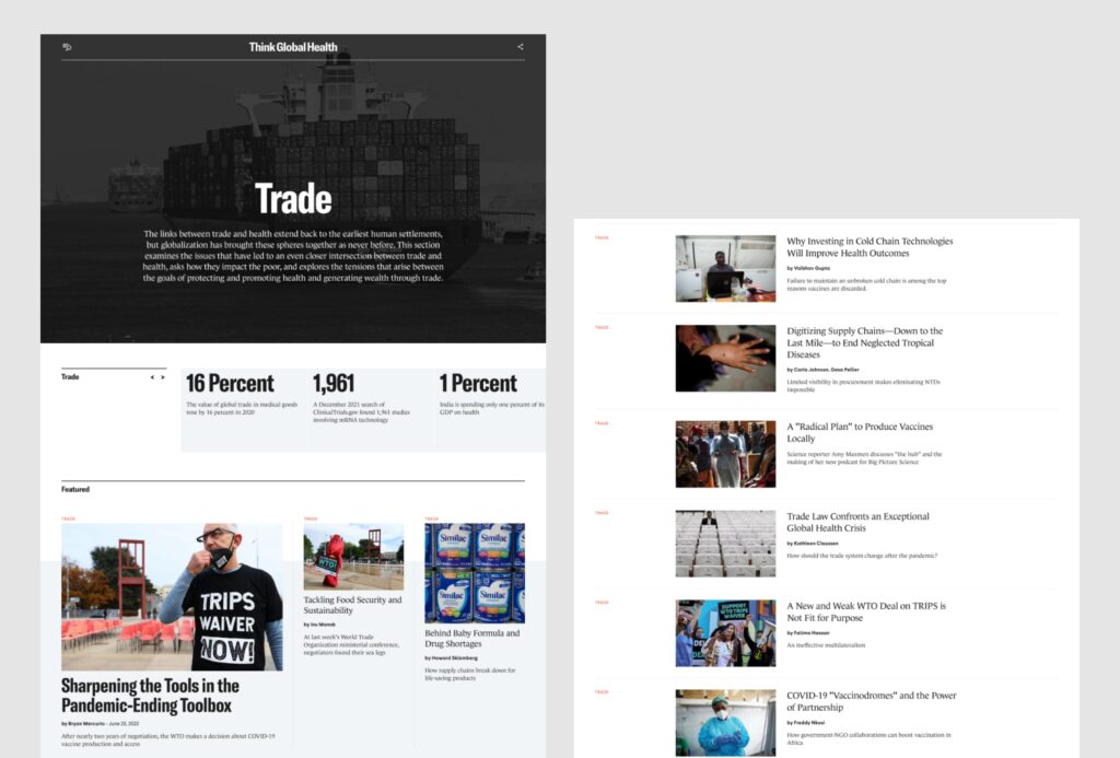
This ensures people have rapid access to specific timely content pieces, or a deep-dive of every content piece relating to an overarching theme.
Don’t search engines penalise sites that feature duplicated content? How can we be sure we won’t lose the value of our search ranking?
Yes, search engines like Google have been known to penalise sites for duplicating content. The intention for this penalty is to protect and prioritise sites that produce original material, rather than those that simply duplicate or syndicate from other sources.
What happens, though, when you’re the one repurposing owned material within your own site?
This is where to use a technique called canonical URLs to avoid any SEO penalty.
The canonical URL involves a snippet of code that defines a single origin for any pages that are surfaced in multiple locations throughout the site.
Think of it as a signal to search engine algorithms that says: ‘we know there are many pages with the same content because we’ve done this intentionally. This page here is the ‘master version’ that you should rank in search engine results pages; you can ignore all of the others.’
With canonical URLs in place, you won’t be penalised by search engines for duplicating content within your website.
If everything is so variable and flexible, how do people find their way from one piece of content to the next?
Animals Australia use a range of techniques to help people orient themselves within the context of the wider site and to promote the continued discovery of relevant content. Some of these include:
- Dynamic breadcrumbs: this secondary navigation scheme provides information to help people understand what content they’re viewing in relation to other, related pages. It also provides a series of quick links to guide people back to previous key pages they may have accessed while navigating through the website.
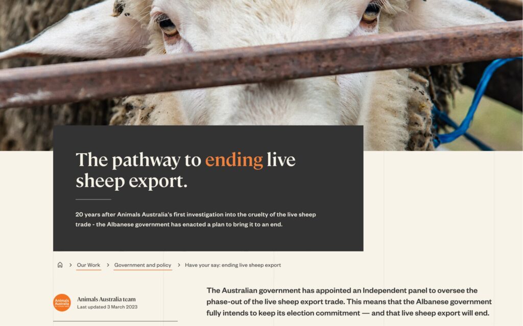
The breadcrumbs in this article point people towards important pages related to this content, being ‘Our Work’ and ‘Live export’.
- A category-specific sidebar navigation: appearing on the side of any editorial article, this navigational feature allows Animals Australia to point people to other key pieces of content that relate to an overarching issue. For example, every content piece that is tagged as being relevant to ‘Live export’ will display links to things you can read—or do—to support Animals Australia’s position on live export.
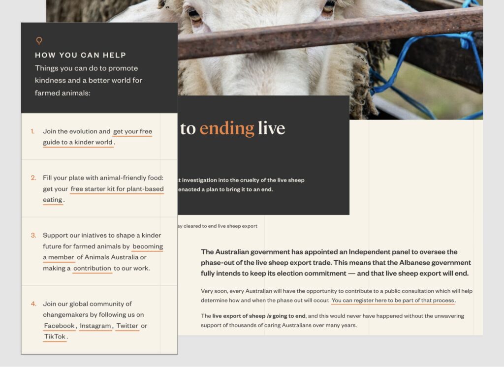
This sidebar navigation provides a handy tool for people to support Animals Australia’s work in relation to different issues.
- Related content at the bottom of each article: which is either automatically updated (pulling in the three most recently published pieces of content that relate to an issue) or manually managed to highlight key content pieces.
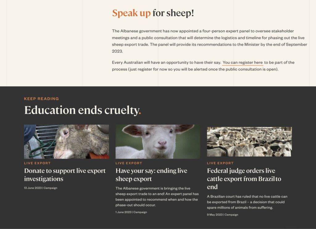
Every article invites readers to discover more content relating to a particular issue or theme.
All of these techniques provide opportunities for people to discover more content and make it easy to move throughout the site.
If you’re grappling with sophisticated content requirements, ‘no wrong door’ could be the right approach.
With the right navigation implementation, you can support people to discover and consume content in the way that most make sense to them.
Alternatively, if you try to force people down singular pathways to key information, you’re only denying your supporters—and ultimately yourself—of value.
More Articles
Up for some more?
Get your monthly fix of August happenings and our curated Super8 delivered straight to your inbox.
Thanks for signing up.
Stay tuned, the next one isn't far away.
Return to the blog.

