- |
- |

I didn’t expect to learn much about copywriting or user interface design while studying Art History. Michelangelo doesn’t have a lot in common with marketing, and analysing Caravaggio won’t necessarily help you with your content. Giotto though – one story about a painter named Giotto has stayed with me.
Sometime in the 13th century, Pope Benedict IX was looking to commission artwork for St. Peter’s Basilica. He had a courtier visit the studios of the finest painters in Italy, to ask them for a submission of work that showcased their artistic skill. As you might expect, all of the artists submitted painstakingly rendered, highly complex works. Time is mastery, or so they thought.
Not Giotto.
According to the story, the Pope’s representative walked into his studio and asked for a submission. “Sure”, replied the artist. He grabbed a blank canvas paper, a paintbrush, and with a singular movement that was both deft and swift, drew a circle on the page.
“There you go”.
Bemused and vaguely insulted, the representative hightailed it back to the Vatican. “That’s it?” he thought.
That was it. As it turns out, Giotto had drawn a geometrically perfect circle – freehand, and in seconds. To this day, there are only a handful of people on the planet who are capable of doing that.
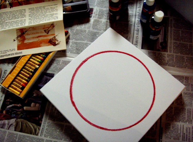
The circle was apparently drawn in bright red paint
Masterful simplicity – an uncomplicated, concise display of complete technical prowess – won out over convoluted complexity. Giotto received his commission.
There’s a reason why this story has endured throughout the ages. Giotto’s circular submission comes as a pleasant surprise, because (like the Pope’s representative) the modern human brain isn’t trained to value that kind of uncomplicated expertise.
Many people appreciate enormity, grandeur, speed, strength, style, flashing lights, bells and whistles, glitz and glam. We often mistake complexity for skill or superiority, and we mislabel considered subtlety as simplicity. Most of us don’t tend to value the masterfully uncluttered. But we really should.
The ability to balance simplicity with complexity; the tendency to make the technical palatable; a knack for making the difficult seem unassuming or easy – often yields the most awesome results. In tech and communications, and in life in general. Giotto knew what he was doing.
Simplexity. That’s the goal.
Simplexity is an emerging philosophical theory that proposes a possible complementary relationship between complexity and simplicity. Not many people are aware that it even exists, but it’s all around us.
Simplexity is clear and concise advertising copy that has been refined and distilled until it is beautiful to read, eye catching and easy to understand.
It is increasingly complicated software and technological applications that are intuitively designed so that kids can use them.
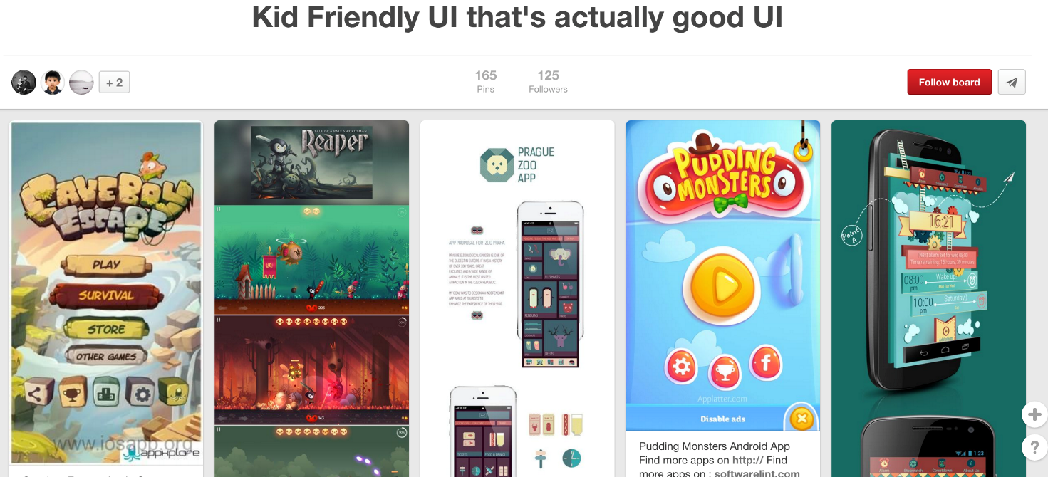
Kid-friendly examples of UI for technical apps
It’s a website design that feels as though you’ve used it a million times, even as you input your contact details to register as a first-time user. It’s the significant amount of developmental consideration that adds a little burst of magic to your experience of an app or system.
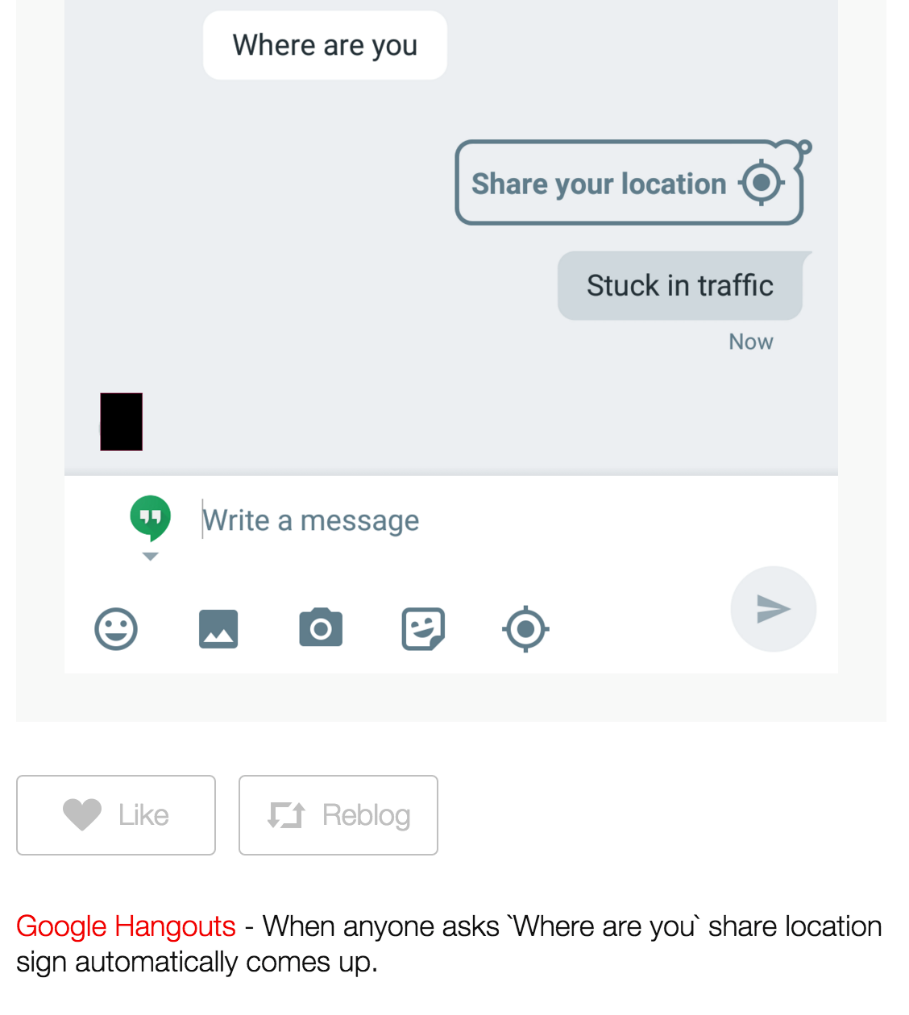
Google Hangouts’ intuitive magic
It’s complex audience data that allows you to make straightforward, logical decisions about how you market your service or product. It’s Steph Curry’s jump shot. It’s awesome.
The problem though, as I said, is that we don’t tend to value or appreciate the precise balancing act that’s involved in achieving this idyllic equilibrium. At least, not consciously.
For some reason, we pit simplicity and complexity against one another.
Why? Users love it when an app, site or system is easy-to-use, but performs a powerful and complex function.
Take the Hemingway web app for example. A single text input field conceals an ingenious functionality. Using automated Readability Index algorithms, the app helps you write more clearly by gauging success with colour-coded signifiers that a child could understand. Simple, complex, empowering, all at once. And we love it.
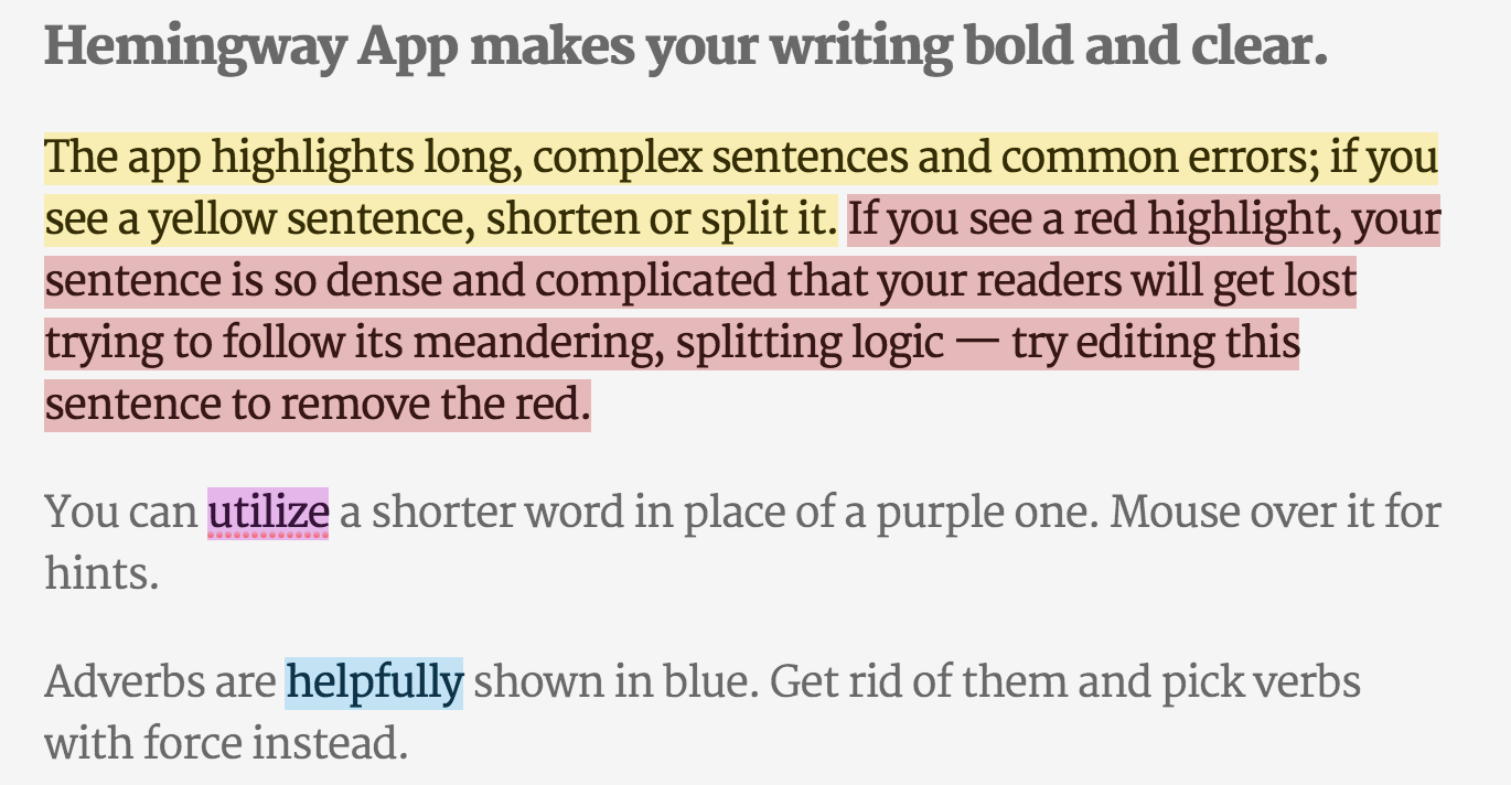
Hemingway App’s text editing input field
Of course we do – it makes us look great when we can write more impactfully, or solve algebraic equations, or talk to a friend in Germany (in German), or have a new snowboard delivered to our office, all by pressing one or two buttons.
We love achieving complicated tasks, but we love simple interfaces that improve the usability and experience of undertaking those tasks. Bill Gates famously said that he likes giving difficult tasks to lazy people, because they tend to find the quickest and easiest ways of achieving things. In some ways, that’s typical of human nature. We love significant outcome from insignificant investment (that’s why lotteries and escalators and diet pills exist).
We love the shortest route to success. In a technological sense, this means we love good, considered design that expertly balances the simple with the complex. A lot of us just don’t know it.
Pitting simplicity and complexity against one another? That’s becoming increasingly irrelevant. They’re intimately interconnected. As Larry Tesler’s Law of Conservation of Complexity suggests, every tool, design or application must have an inherent amount of irreducible complexity. You can only ever transfer complexity, never remove it – even from the most supposedly straightforward of devices.
If a system is going to be easy to build, it might end up being more difficult to use. If a significant amount of complex consideration goes into a UI design, you hope it will be easier to navigate.
According to Tesler, we can’t ever remove complexity. But what we can – and should – be doing, is embracing both simplicity and complexity at once. Here’s how to go about doing just that.
Embracing Simplexity.
If you’re going to embrace the concept of simplexity, then you’re going to need to revise the way you think about both the ‘complex’ and the ‘simple’. They’re not oppositional terms, and they’re much more diverse than many people think.
This process is a great way of altering your understanding of both. It’s useful for identifying the best way to approach an idea, system or product too. According to Kalid Azad and this great article, when you’re looking at things through the lens of simplexity, there are four general ways to conceive and categorize any tool or concept:
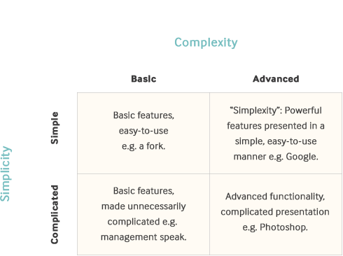
Simple + basic.
This is the common perception of ‘simple’. The functionality is basic, and the presentation of the functionality is simple. Think of tools like a fork, the wheel or a pencil: there is a singular, primary functionality that is self-evident upon engaging with the device. In a digital sense, think of a single-function web app, like this online alarm clock.
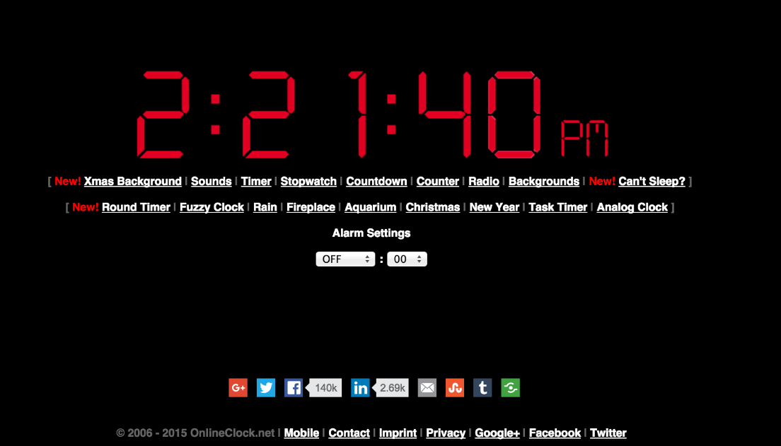
onlineclock.net’s splash page
Complicated + basic.
This is probably the least useful of the four approaches – it involves a vastly over-complicated means of achieving something straightforward. Think about bad writing or “management speak”: a lot of people take a paragraph to communicate what can be written in one carefully considered sentence. Frustrating web design falls under this category. Why force users to click through several pages to sign up? For a mechanical expression of the phenomenon, imagine a Rube Goldberg Machine: a contraption, invention, device or apparatus that is over-engineered to perform a simple task in a convoluted fashion, usually including a chain reaction.
Complicated + advanced.
This is the widely held notion of ‘complex’. The functionality is complicated, and the presentation of the functionality mirrors the advanced nature of the tool’s purpose. Imagine a huge recording studio mixing desk, or the user interface for Photoshop – incredibly powerful items with a hugely variable range as to how they can be used and implemented.
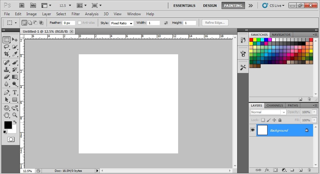
Adobe Photoshop’s user interface
Simple + advanced.
Simplexity: the sweet spot. This is highly advanced and powerful functionality that is presented in an easy-to-use manner. Think of Google’s landing page, featuring one search bar and two buttons. It’s an incredibly straightforward depiction of an insanely potent piece of technology. This is where we file good UI.
Take Airbnb’s website, which aggregates and collates significant amounts of variable data (60,000,000 guests; 34,000 cities; 2,000,000 listings; 190+ countries), then presents it all seamlessly and attractively. The page design is clearly considered, to facilitate a simple experience. As soon as you open any accommodation page, grid-blocked images of the relevant apartment responsively fill up the top portion of your screen. Underneath the pictures, essential information is presented, including the number of people who can be accommodated in each house, previous guest ratings, and host profile information. Further scrolling serves to reveal additional information, including listed amenities and house features. The booking widget is present on screen at all times to ensure that accommodation is never more than a click away. It’s an impressive display of impactful information hierarchy design: everything a user needs is presented clearly, in a logical order that is easy to understand and enjoyable to navigate.

An Airbnb listing page
Another fantastic digital example of simplexity is this gorgeous brochure site for Carlo Rivelli’s ‘Seven Brief Lessons on Physics’. In order to provide a practical sense of the implication of the ‘lessons’, each of the seven pages has an interactivity that showcases the nature of that principle: dots on the page move, dance, swerve and collide in accordance with the relevant physics principle. The site does an exceptional job of articulating the book’s content – as a user, without even reading any copy, I have an immediate, tactile sense of the material. Not only that, I’m enchanted and enthralled with the prospect of learning more. Complicated and potentially alienating material is made palatable by the simple, engaging nature of its digital presentation. Inspired.
Once you embrace the idea that simplicity can (and should) accompany complexity, you can start looking for opportunities to marry the two in most of your endeavours – from writing, to design, to UI and UX, to the way you talk to your clients and the way you talk to or brief your colleagues.
The simple/complicated “simplicity” spectrum describes how easy something is to understand. The basic/advanced “complexity” spectrum describes how powerful something is.
In a digital agency environment, we’re never too far removed from a complicated thought, system, paradigm or problem. The really complex part of the equation is learning to articulate things clearly and concisely, so they’re simple and easy-to-use or interpret.
Admittedly, it’s hard work making things easy. It’s a skill you’ll need to foster and develop. But as Giotto can attest, it’s often well worth all of the extra effort. Your users, your clients, and your clients’ customers will thank you.
If you’re still coming ’round to the idea of Giotto’s perfect ‘O’, remember the outcome of the story. The proof is in the Pope’s response, all those centuries ago. In design, communication and development – as ever – simple things done well (or with advanced expertise) simply do well.
More Articles
Up for some more?
Get your monthly fix of August happenings and our curated Super8 delivered straight to your inbox.
Thanks for signing up.
Stay tuned, the next one isn't far away.
Return to the blog.

