- |
- |

Images play a crucial role in effective interface design. They help us to connect with content and they help us to validate, understand and encode information. After all, a picture’s worth a thousand words. But what if you have no pictures? And have to convey, in fact, 100,000 words. What then?
This scenario is surprisingly commonplace in government websites, where information can be in-depth and expansive.
In some cases, photos may be inappropriate because you’re dealing with sensitive content.
In others, photos can be limited in their relevance to the material. Ask yourself: what imagery would you include in a content piece about the arbitration of small business disputes within the agricultural sector?
Sometimes, the main objective of the site is to find precise information as quickly as possible, and big, bold imagery only adds to the noise.
There’s evidence to suggest that images do play a vital role in reducing cognitive overload for people reading content. However, if you can’t—or don’t want to—use imagery throughout a website, here are the best practices techniques to keep things interesting, usable, and enjoyable.
Break up the content for skim readers.
People read in a very specific way when looking through information on a website. To put it another way, they don’t read at all. They skim.
This may be because our attention spans have been systematically shortened over time. Or because we’re looking to find the right information, fast.
Either way, long, singular slabs of text make it much harder to quickly skim content for relevant information.
Subheadings, small paragraphs and bullet lists make things easier to scan, and therefore easier for people to find what they’re after.
The Victorian Small Business Commission uses the technique of content segmentation to great effect. Although there’s a huge amount of copy on this page, it’s eminently scannable thanks to different sections that break things out.
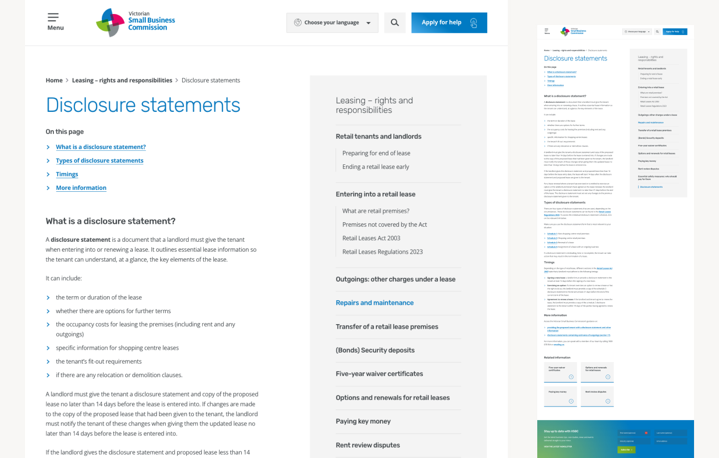
The VSBC website uses subheadings, bullet points and other structural formatting techniques to help break out long content pages.
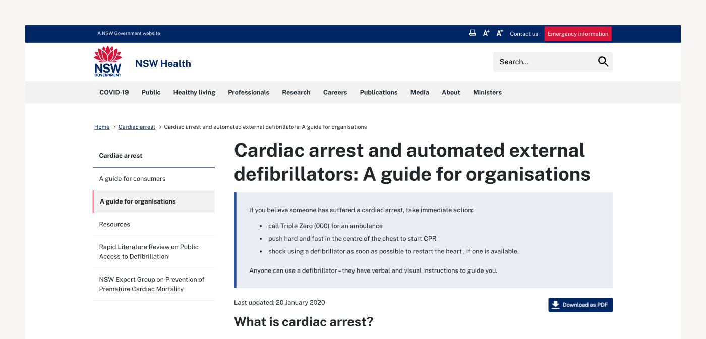
Using soft changes in background colour is another way to create easily distinguishable ‘chunks’ of content, rather than one huge, indiscriminate slab of material.
The New South Wales Department of Health uses colour blocking to highlight critical information at the top of this content page providing a guide to defibrillator requirements for organisations.
Colour can help people to distinguish different sections of long-form content, improving your ability to skim read the material.
Make it easy to read.
Ethos CRS rates Services Australia—the government agency responsible for shaping how government services and payments are delivered to communities—as the most readable government website on the internet.
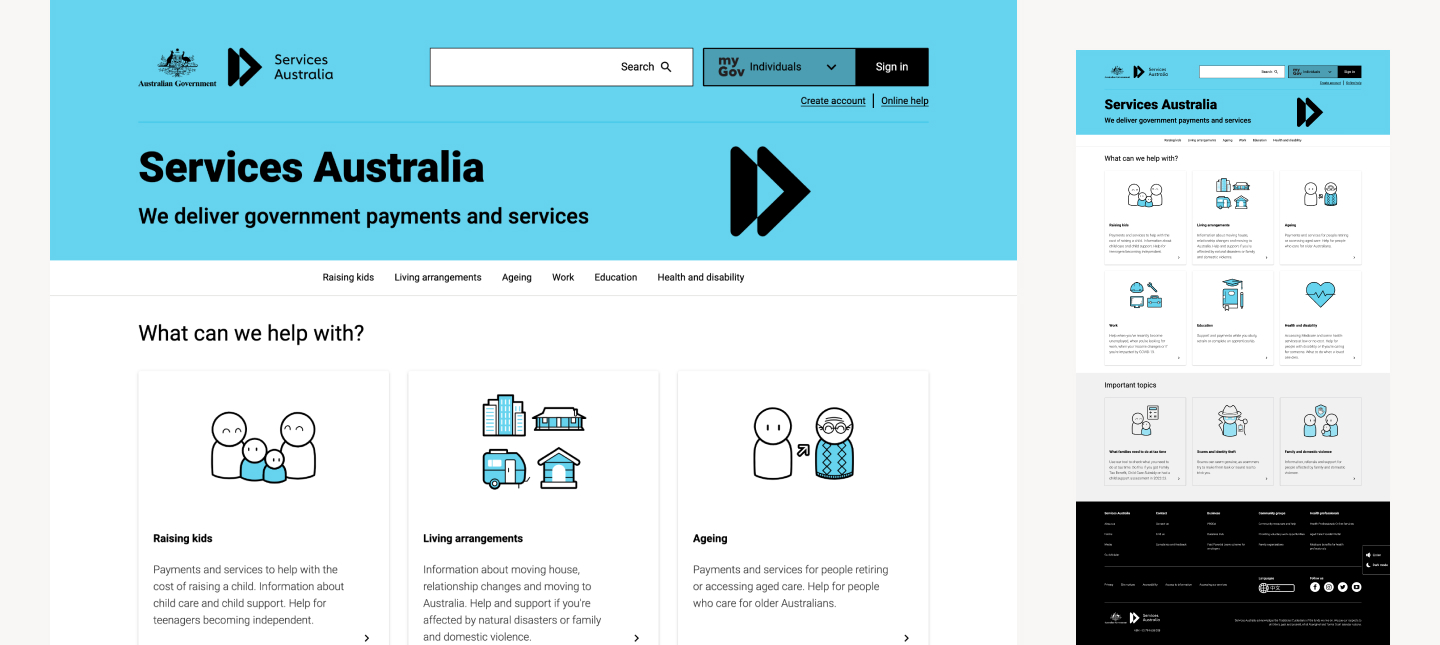
The home page of the Services Australia website, a leading example of design for text-heavy content.
What factors make website content easy to read?
Avoid information overload and promote quick discovery.
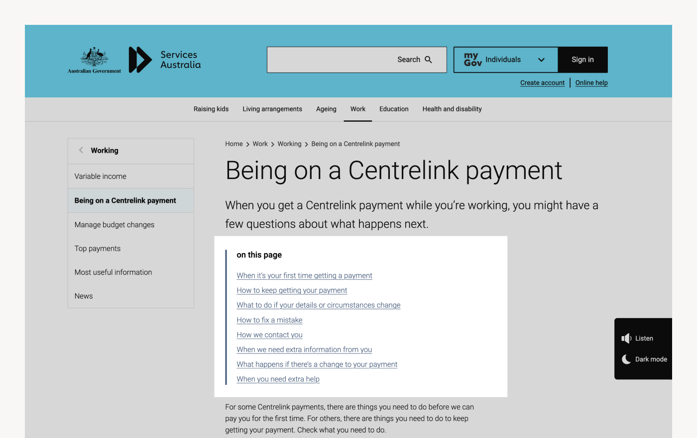
There are usually subsets of information within any single content page. Take this page from the Services Australia website, which offers a high-level guide to receiving Centrelink payments.
Within the one content page, there are clear subsections, including:
- When it’s your first time getting a payment
- How to keep getting your payment
- What to do if your details or circumstances change, and more
Drop links help people navigate to the on-page content they need without having to scroll through irrelevant material.
To save people having to scroll through all of this content to find what they need, Services Australia uses anchored drop-links to help people immediately navigate to the right section within the page.
These drop-links also correspond to content chunks, which encourages the dual benefit of breaking the content out into smaller digestible sub-sections.
Consider spacing and text width.
The readability of text is impacted by the amount of characters you include on each line of text.
Research conducted by the Baymard Institute suggests longer lines of text are typically perceived as overwhelming. As a result, people will avoid reading them and disengage from the content.
Emil Ruder—a noted graphic designer from the mid-twentieth century—conducted famous research into line length and readability. His work concluded that the optimal line length for detailed body text is 50-60 characters per line.
Recent studies suggest this range can justifiably extend to 75 characters, including spaces.
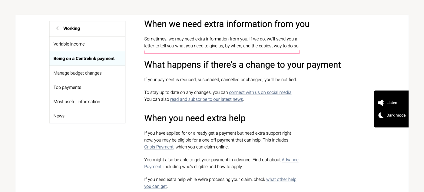
Services Australia’s website aligns with the optimum line length, being 50 to ~75 characters.
The consequences of breaking this optimum line length are:
- Too wide: readers will have difficulty focusing on the text, because it’s harder to gauge where the line starts and ends. It’s equally difficult to determine how far through you’ve read through a section of content. As a result, readers will continually lose their place or reread the same lines.
- Too narrow: the reader’s eye is forced to travel back and forth in quick succession when your text width is too short. This tends to create unnecessary stress for readers, making them skip potentially important words and compromise overall comprehension of information.
Text hierarchy is critical.
When you’re dealing with dense, long form content, it’s crucial to guide your reader through the information.
What is the most important message on the page? In what order should people read things? Where should their eye be drawn? Is there any text that must be read in a certain sequence?
A clear visual hierarchy will naturally guide people through the most important elements of the page in the appropriate, intended sequence.
The most important content should be at a large font size and boldly emphasised. This will encourage people to read it first. The next most important message should appear in a slightly less emphasised style, and so forth. Supporting content associated with key ideas is styled differently to completely new ideas or topics.
This example from the Victorian Public Sector Commission provides a good example of hierarchy and clear visual guidance.
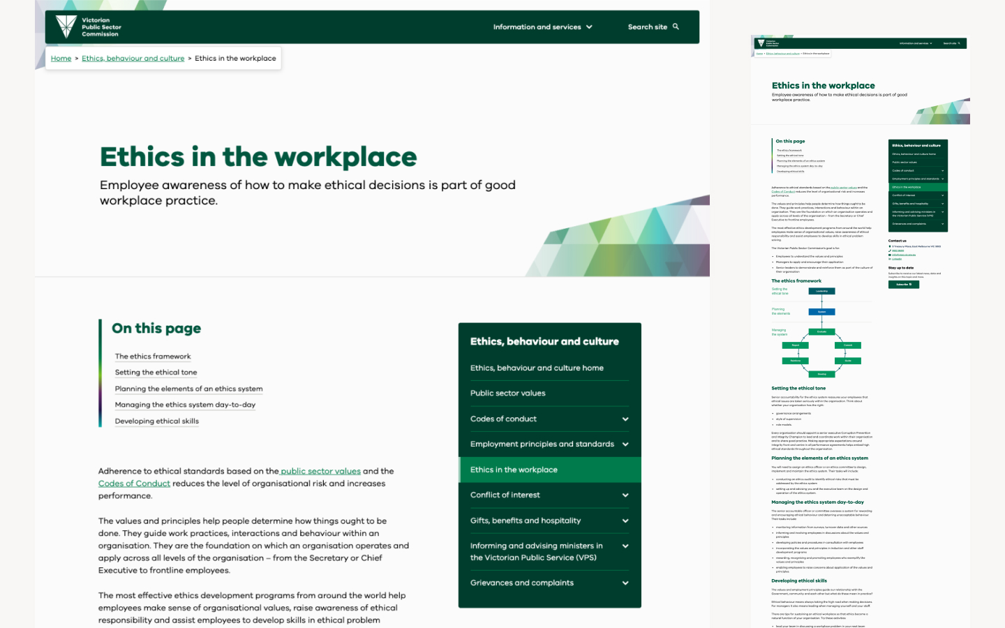
The VPSC website does an excellent job of guiding people through content in an appropriate sequence.
The squint test is a great way to test the hierarchy and visual processing order of any design, whether in an interface or presentation. This simple two-second test helps you to assess boldness, weighting and emphasis.
Pull quotes can also help in breaking up text, contributing to visual differentiation, and making the page content easier to skim read.
Consider Miller’s law and the importance of ‘chunking’.
In 1956, psychologist and researcher George Miller studied the limitations of human capacity for processing information.
Miller discovered that most people are capable of storing seven items (plus or minus two) in their short-term memory. Going beyond this limit makes it difficult for people to memorise information.
As a result, Miller proposed the idea of ‘chunking’ information together for better comprehension and recollection in 1956. To illustrate the positive effect of chunking, you’ll likely find it easier to memorise the phone number 1300284878 when it’s styled as 1300-284-878.
In the context of content-heavy government websites, use the concept of chunking to organise content into smaller blocks—grouped by subheadings to aid in skim reading and provide clear informational hierarchy—to help people find, process, and retain information more effectively.
Systemise your approach.
Whichever techniques you decide to employ, keep things consistent.
The goal is to ensure readers can consume information easily and establish familiarity with frequently used conventions. For example, if you present ‘related content’ in a certain way, try to ensure that convention is always used consistently in every instance that related content appears throughout the site.
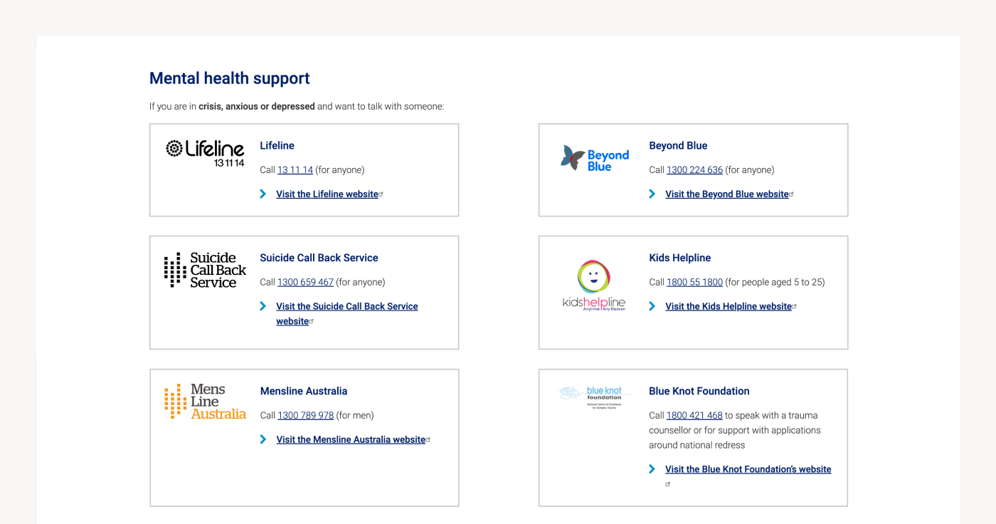
In the Australian Federal Government’s disability support gateway, this card styling convention is consistently used to indicate a jump off link to third-party provider’s website.
Learning new representations for the same type of information is frustrating and confusing. The more you reduce the amount of learning required for people to navigate through content, the better. By adhering to established principles of consistency and standards, we can learn one convention and navigate freely from then on.
Systemised conventions also ensure the site can scale easily as you publish more content over time.
Wrapping up.
There you have it. Hopefully it’s been easy to rapidly scan this content and find the information you’re after, even though there are a couple of images dotted throughout the copy content in this article.
In addition to providing a best-practice checklist for content heavy government websites, these techniques are generally applicable for all types of digital content.
If you’re embarking on a government website project with sophisticated content requirements—or any website project with sophisticated content requirements—I’d love to help.
Get in contact with the team today and lets tee up a chat.
Otherwise, these resources might help provide some useful insights or reference materials in the meantime:
More Articles
Up for some more?
Get your monthly fix of August happenings and our curated Super8 delivered straight to your inbox.
Thanks for signing up.
Stay tuned, the next one isn't far away.
Return to the blog.

