Building a highly effective website brief in a multi-stakeholder NFP environment.
- |
- |

It’s always exciting being on the cusp of building or redeveloping a website. Opportunity abounds. The potential is limitless. And everyone is brimming with ideas.
Concurrently though, everyone is also brimming with different—sometimes competing—priorities. There are different objectives across disparate teams or business units. There are stakeholders who are crucial to the success of the project, but who may not be overly familiar with what it takes to build an effective website product. Or, equally, how to ask for what they need in order for the site to best serve their interests.
Some people throughout the organisation actually want the same thing but ask for it in different ways. One person’s ‘content hub’ is another person’s ‘interactive digital resource platform’.
Typically, there will be some reference sites thrown into the mix to serve as inspiration; a benchmark for what the new site could or should be. It all looks sleek and polished, and everyone’s excitement levels rise again.
For all the excitement though, there are challenges on the horizon. They can’t be overcome by simply adding everyone’s wish list into a Google doc and pushing forward.
History is littered with cautionary tales highlighting the perils of design by committee.
Take the Pontiac Aztek for example. Built through an intentional process of ‘design by committee’, the Aztek was a commercial disaster for General Motors in the early 2000s. It’s still universally derided as one of the ugliest cars ever produced.
If the project starts now, things will only get more challenging as time rolls on. Any variance between teams and stakeholders will only compound and resonate throughout the delivery of the project. And at this point, there can be significant variance.
Unpacking the challenges of crafting a brief.
First up, it’s worth defining key terminology (pro tip: this is also one of the first things to do when crafting a brief).
What do we mean by ‘multi-stakeholder NFP environment’?
There’s no hard or fast definition, but for the purpose of this piece, let’s talk in the context of a newly federated national charity.
A federated model consists of a single national presence that operates registered, independent local branches. Most national Australian not-for-profits and charities are structured as federations, like Foodbank and Cystic Fibrosis Australia. Many sporting bodies are federated too.
There’s evidence to suggest that thousands of these organisations could benefit from the efficiencies of consolidation.
“In particular the Community Council for Australia and other peak bodies have been calling upon charities to consider merging… in a bid to reduce competition for increasingly limited funding.” – Clarissa Sukkar
Guide Dogs provides a great example of how the members of a federation can work together.
Originally, there were multiple state-based branches with individual brands, teams, and processes: Guide Dogs Queensland, Guide Dogs South Australia, and so on.
Following a unification project, they all moved together to pool resources and leverage efficiencies under a single, cohesive national banner.
Understandably, the website was a crucial part of this process. Five distinct, individual teams—each with their own sites—came together under the one banner.
This inevitably means navigating:
- Legacy business processes, functionalities, and systems.
- Different priorities and budgetary constraints.
- Differences in expectation of what can be delivered, or different benchmarks against budgets.
- Different ways of providing and articulating services.
- Different expectations of what the new website could or should do for the organisation.
- Potentially, different cultures and variable interests or motivations within those cultures. For example, working with a range of non-profits, it’s common for fundraising teams to build out new initiatives and continually annex them to an existing base of functionality. This approach can create short-term wins but ultimately contribute to long-term entropy. On the other hand, marketing teams often do the opposite, taking a more consistent and cohesive approach that fundraising teams may deem ineffectual, given more aggressive revenue targets.
It is absolutely critical to navigate these challenges before you build anything.
Sure, there’s value in rapid prototyping to test and learn on the fly, but there’s also significant cost associated with rework when things aren’t right.
And in a not-for-profit environment, where donations and fundraising dollars are hard-earned and government funding can be scrutinised, maximising the value of every dollar is crucial.
Context sheets: a potent and efficient way to build a brief in complex, multi-stakeholder environments.
‘Context sheets’—a co-design tool run via a workshop format—is an incredibly effective way to align a wide variety of stakeholders throughout your organisation.
Everyone from CEOs to client-facing service providers can, and should, participate. At the very least, there should be a representative from every key stakeholder group affected by the website project. This could be anywhere from five to 25 people; some teams, like Mercy Health, have even run multiple versions of the same workshop with a core group of consistent attendees to accommodate larger stakeholder numbers.
By the end of the facilitated session, which takes far less time than it would for your team to compile and write a brief, all key stakeholders will have a comprehensive understanding and documented outline of the project, with:
- Consolidated alignment on what the work involves.
- A thorough understanding of why the project is important for the organisation, along with any unique objectives for various stakeholders and a sense of priority for those objectives.
- How the success of the project will be measured.
- Risks and challenges the team may face as a collective.
- Acknowledgement of any platforms or technologies that must be considered throughout the project, whether existing or desired in the future.
- Visibility of any constraints, including budgets, deadlines, or unique processes that are critical to the delivery of the work (for example, the legal or regulatory review of certain aspects of website content).
- How far to push the envelope in the work, and the team’s shared appetite for risk in doing so.
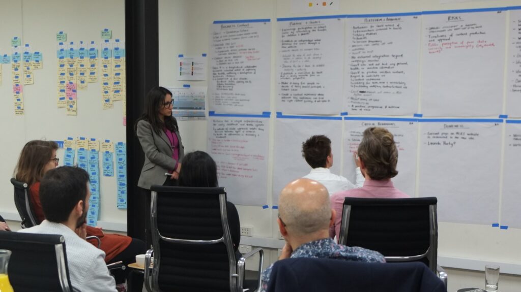
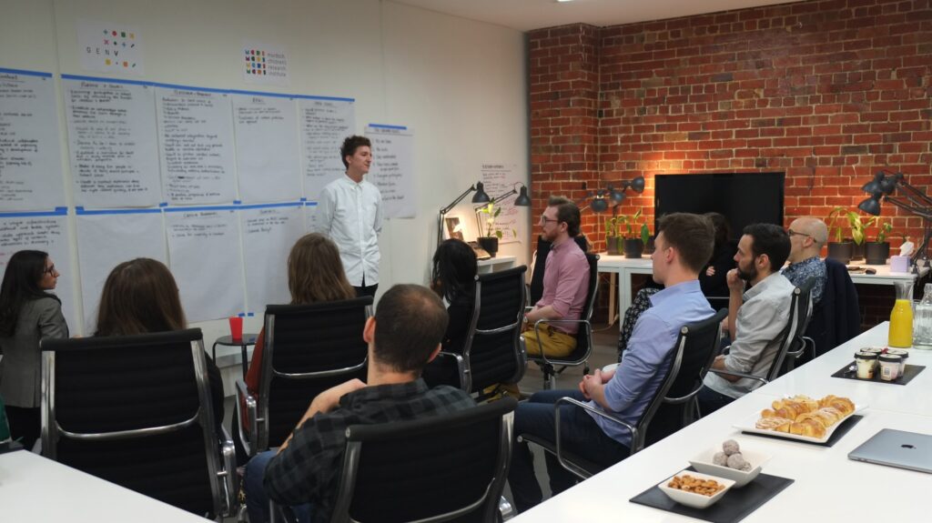
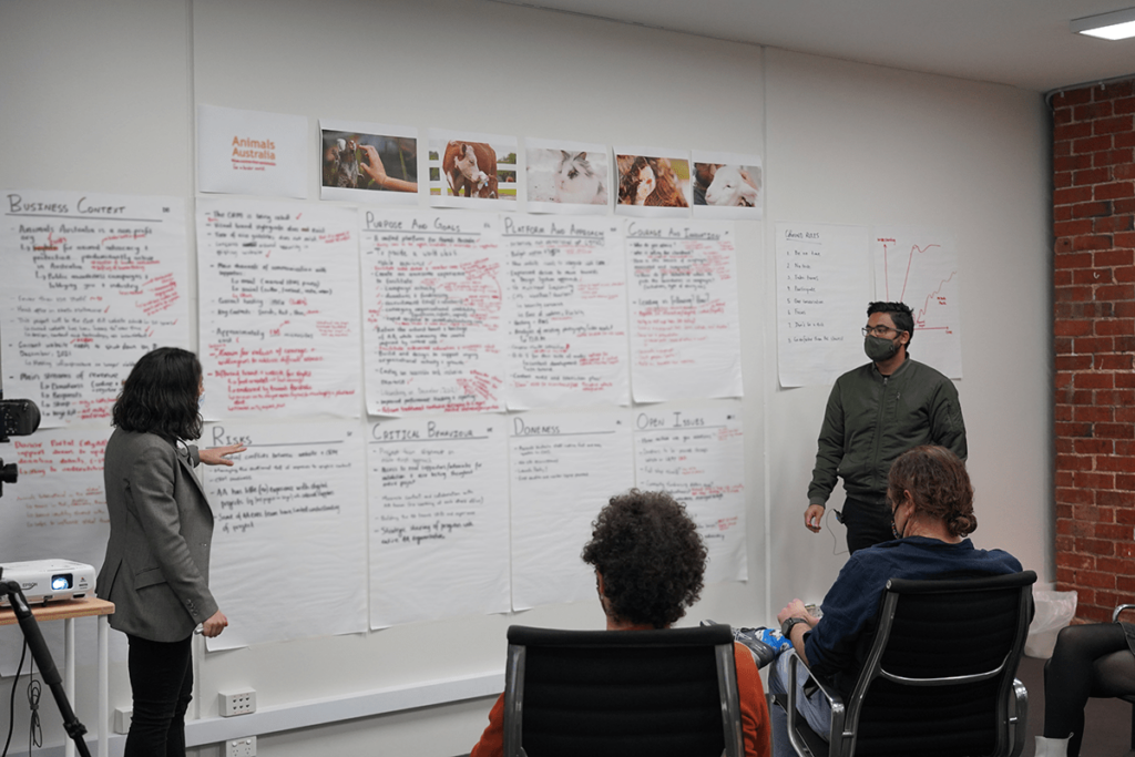
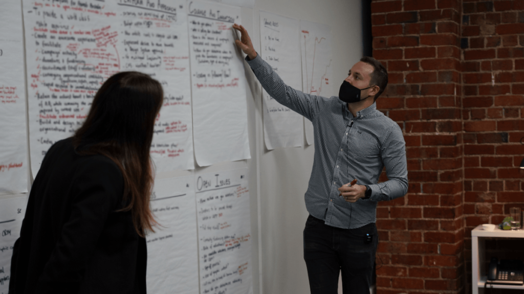
This is all achieved with little more than a room of project stakeholders, eight large sheets of paper, two coloured markers, and an experienced team to facilitate and document the conversations. The process typically takes about three hours.
Here’s what it looks like in action:


Building on proven frameworks for learning and alignment.
This design tool is uniquely designed to ‘flatten the room’. That is, to eliminate the variance in the team’s collective understanding of the project. It is crucial this is done in an open, collaborative forum.
In order to truly flatten the room, context sheets draw on a number of proven techniques to momentarily suspend organisational hierarchies, power dynamics, and other barriers that can impede effective communication and collaboration between multidisciplinary teams.
The experience is predicated on psychological and pedagogical frameworks that help people most accurately process and retain information.
These include:
- The flipped classroom: a type of blended learning which aims to increase engagement and knowledge retention. Rather than have a sole voice as the leader of the ‘lesson’ or meeting, the flipped classroom intentionally shifts instruction to a participant-led dynamic. This approach leads to interactions that explore topics in greater depth to create more ingrained and meaningful learning opportunities, rather than passive knowledge transmission from ‘teacher’ to ‘student’. Alison King’s 1993 work ‘From Sage on the Stage to Guide on the Side’—while not a directly articulating the flipped classroom approach—explores the importance of using interactions for construction of meaning rather than knowledge transmission.
- The Socratic learning method: a form of cooperative dialogue between individuals, based on asking and answering questions in specific formats to stimulate critical thinking and to draw out ideas and underlying presumptions.
- The VAK learning styles model*: developed by psychologists in the 1920s, this model suggests that most people learn in one of three ways, being ‘visual’, ‘auditory’, or ‘kinesthetic’.
-
- Visually dominant learners absorb and retain information better when it is presented in some visual form. The workshop features large sheets with easy-to-read handwriting in thick marker to cater to visually dominant learners. The handwriting captured on the sheets is used to document key points from the participants’ conversation.
- Auditory-dominant learners prefer listening to what is being presented. These learners respond best to people describing concepts in conversation. As a facilitated dialogue between stakeholders and delivery team members, the workshop format perfectly caters to auditory-dominant learners.
- Kinesthetic-dominant learners prefer to learn through physical, tactile experiences. This is why handwritten content is added to the sheets over time; the team literally ‘builds’ the brief based on key information offered up throughout the discussion.
- It is worth nothing the learning styles model has been contested in its original form, and new perspectives suggest learning styles are perhaps less important than facilitating meaningful connections between new and existing knowledge. Whichever perspective you subscribe to, context sheets provide an experience that aligns with the learning styles model while supporting the connection of old and new information. Ultimately, this leads to far more effective encoding of ideas and information for participants.
Why is it so important that we have open, collaborative, and documented conversations to calibrate a shared understanding of the work?
Imagine a scenario. You’re in a traditional briefing session where every attendee writes their own personal notes in reflection of the conversation. Any discrepancy between peoples’ understanding of the project is rarely identified, let alone broached.
What happens when the team members from that session return to their teams, and the discrepancy of understanding echoes throughout the organisation? Confusion abounds. The higher the likelihood of confusion in delivery, the greater the chance for errors, misalignment, and potentially expensive rework.
Conversely, context sheets act as a singular, shared collection of detailed notes that stakeholders validate together.
This is crucial to the success of the brief because it ensures the team will:
- Uncover all past conversations and information, rather than one individual’s perception of what is important.
- Create a forum for cross-disciplinary conversations that need to happen.
- Make expectations, roles and responsibilities explicit and ensure that all people commit to agreed outcomes via the VAK learning model.
- Increase ownership and engagement for different people involved in the project.
Building a brief is a delicate balancing act that requires a robust, proven process.
The way you construct your brief is absolutely critical to the success of your campaign or website project. At the same time, it’s an incredibly delicate balancing act to navigate.
This is because:
- Not enough structure or clarity can result in misalignment, expensive rework, wasted time, and disenfranchised teams or stakeholders.
- Too much structure—provided by too few voices—runs the risk of being prescriptive, reductive, or missing opportunities and challenges that other voices may have been able to contribute.
- Too many voices, without any agreement on hierarchy, weighting, or priority results in design by committee. And as we’ve established, very few people want to end up with a Pontiac Aztek.
When there’s so much at stake, it’s worth investing in a proven, replicable process. One that’s backed by research and sound evidence base, and has been used to great effect by marketing teams in some of Australia’s largest and most loved non-profits.
Context sheets tick every box.
More Articles
Up for some more?
Get your monthly fix of August happenings and our curated Super8 delivered straight to your inbox.
Thanks for signing up.
Stay tuned, the next one isn't far away.
Return to the blog.

